

One system, three journeys: how role-based information architecture unlocked ad management at Arezzo&Co Group
TL;DR — Product Designer, working on the UX and UI of the solution, 3 months. UX and UI development of a white-label app — built in partnership with a technology partner — linked to Facebook Business Manager, for submitting and tracking Arezzo&Co store ads run on Instagram, replacing the tool previously used by the group. Three profiles with radically different needs — Marketing, Traffic Managers, and Store Owners — served within a single platform with role-adapted information architecture.
Context & Problem
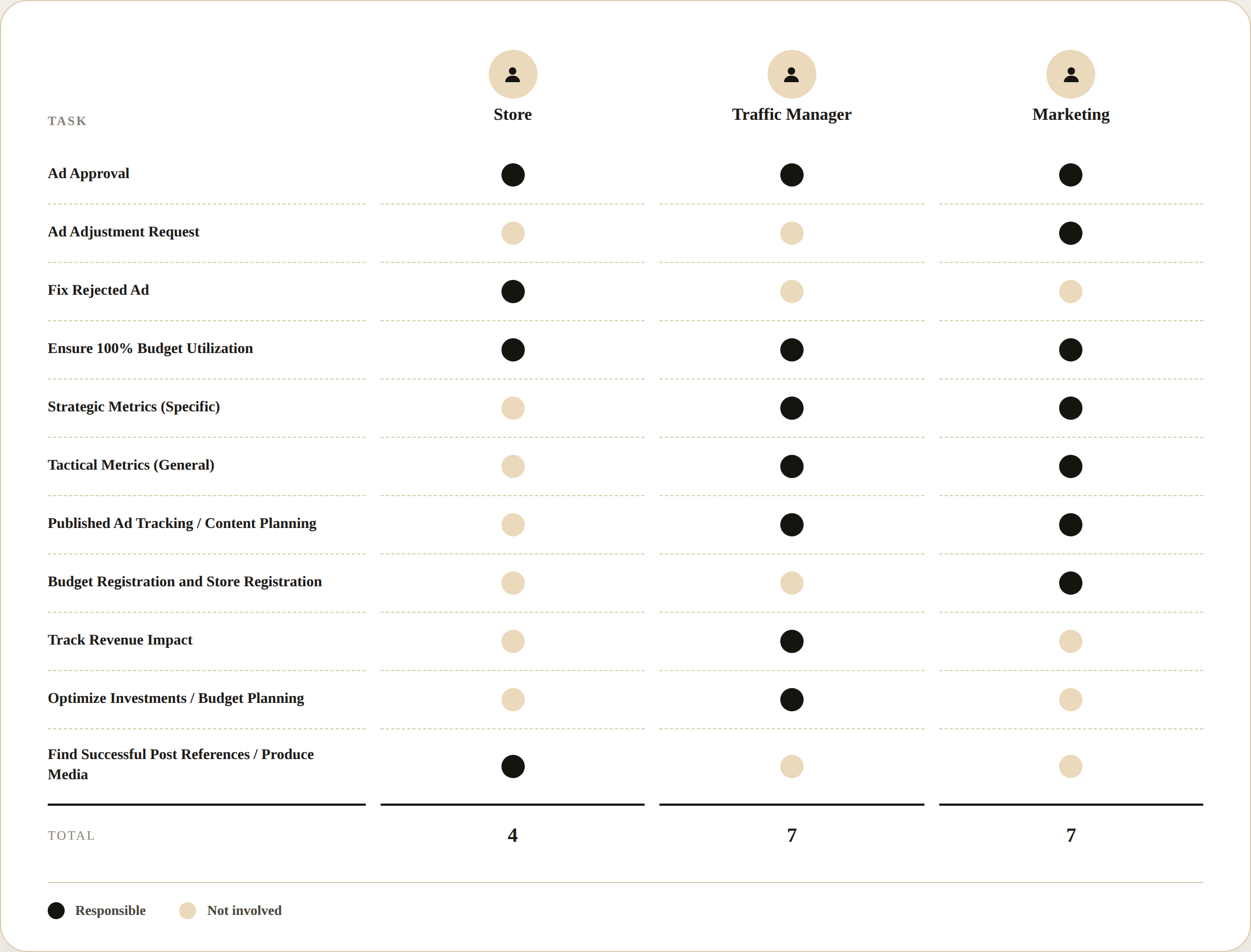
The Arezzo&Co group operated multiple brands (Arezzo, Schutz, and others) with hundreds of physical stores, each with autonomy to create and submit social media ads. The chain involved three actors with distinct goals: the Store Owner who created and tracked their own ads, the Traffic Manager who supervised a set of stores and approved the creatives, and the Marketing team who monitored consolidated brand performance and managed budgets.
I came in as a Product Designer, working on the UX and UI of the solution, responsible for the full project — conducting interviews with each user profile, mapping journeys and role-based information architecture, and designing all interfaces (web and mobile) in Figma over 3 months. The project was built in partnership with a technology partner, and consisted of developing a third app — with a white-label approach, aimed at the group’s brands (Arezzo, Schutz, and Anacapri) — linked to Facebook Business Manager, replacing the ad management tool previously used by the group.
The scope had three hard constraints: the solution had to be a single coherent platform with differentiated routes per role, not three separate products; it had to serve Arezzo, Schutz, and other group brands with visual consistency without losing each brand’s identity where it mattered; and a 3-month timeline covered research, architecture, design, and prototyping of web + mobile for all three profiles.
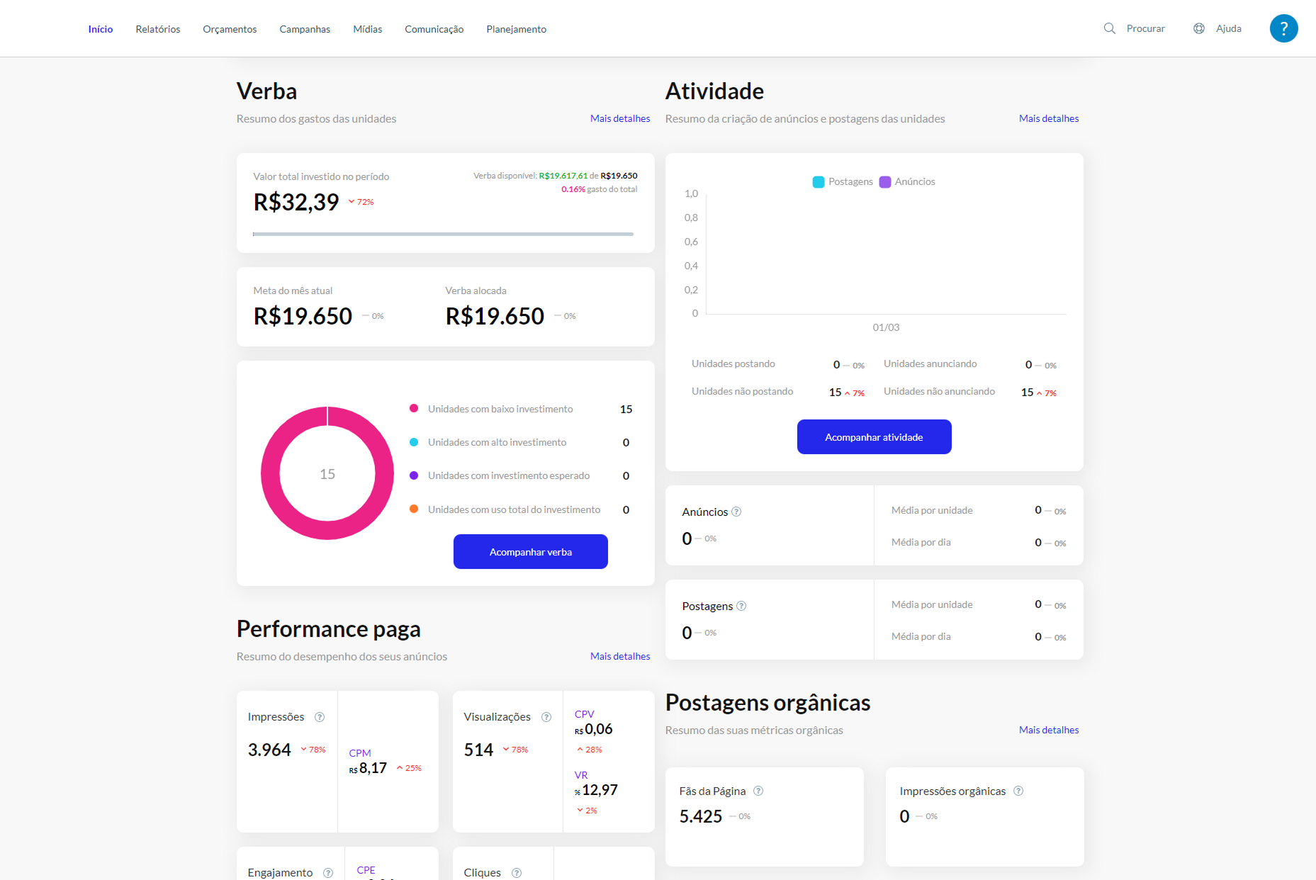
Prior state: the tool previously used by the group had no role differentiation — Store Owner, Traffic Manager, and Marketing all accessed essentially the same screens regardless of what they needed to do, with Store Owners getting lost in corporate metrics and Marketing unable to get a consolidated view without navigating store by store.
Discovery & Insight
The interviews revealed that the problem wasn’t missing functionality — it was wrong audience. The system had the right information, but routed it to whoever didn’t need it. A Store Owner didn’t need the consolidated ROAS of all 350 group stores; they needed to know if their ad had been approved and how much budget they had left. A Traffic Manager managed approvals across a portfolio of stores — their question was “what’s pending and from where,” not how to create a submission. Marketing was the only profile that needed the full funnel, from impressions to sales, for the entire brand.
Consolidating 2 interviews with internal stakeholders and a review of 2 existing dashboards into a single board revealed that “budget” was the thread running through every source — just under a different label each time:
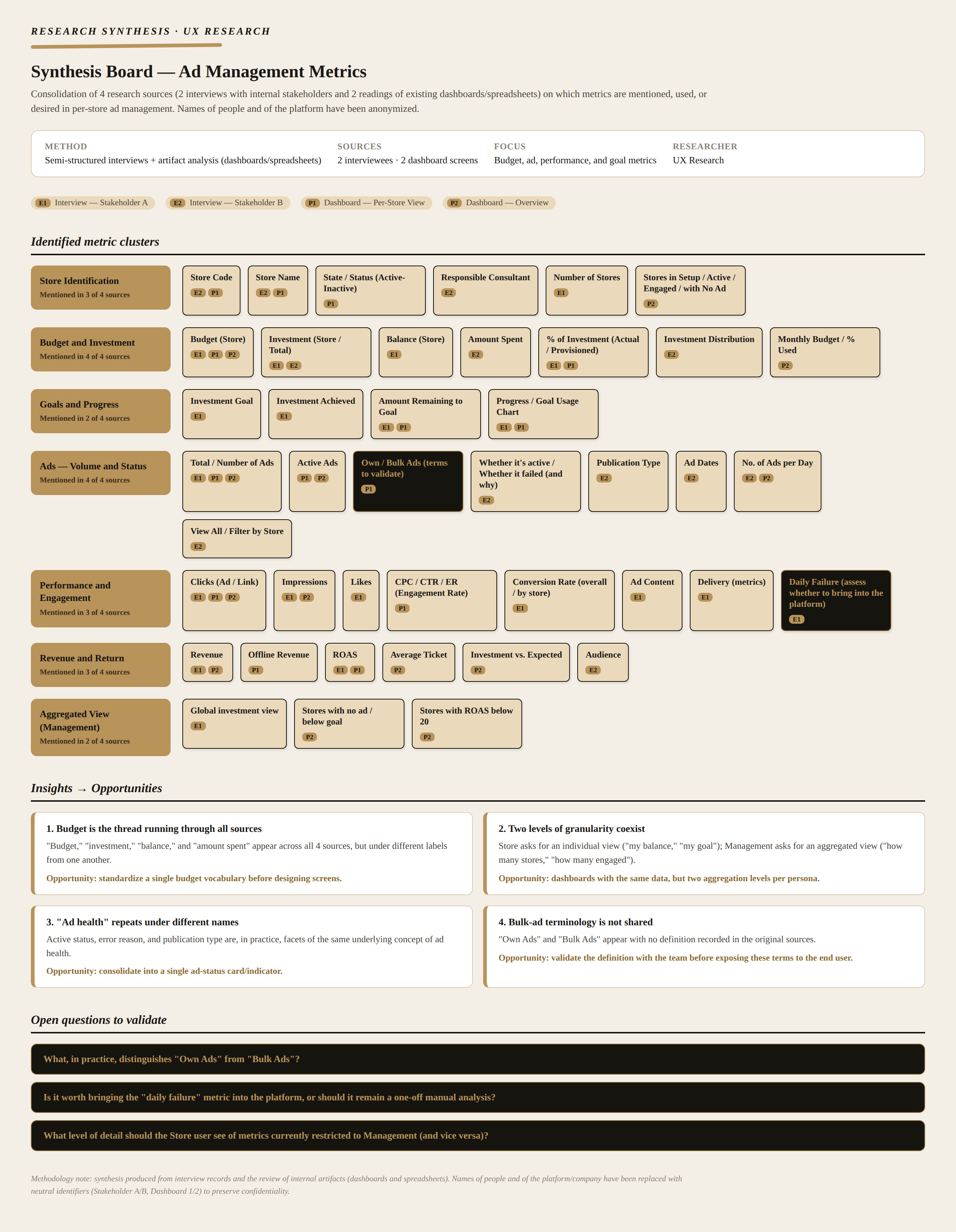
The turning point: that made this an information architecture problem, not an interface one. Each profile needed a different product inside the same system.
I designed a Value Proposition Canvas for each of the three profiles — the example below is the Marketing one:
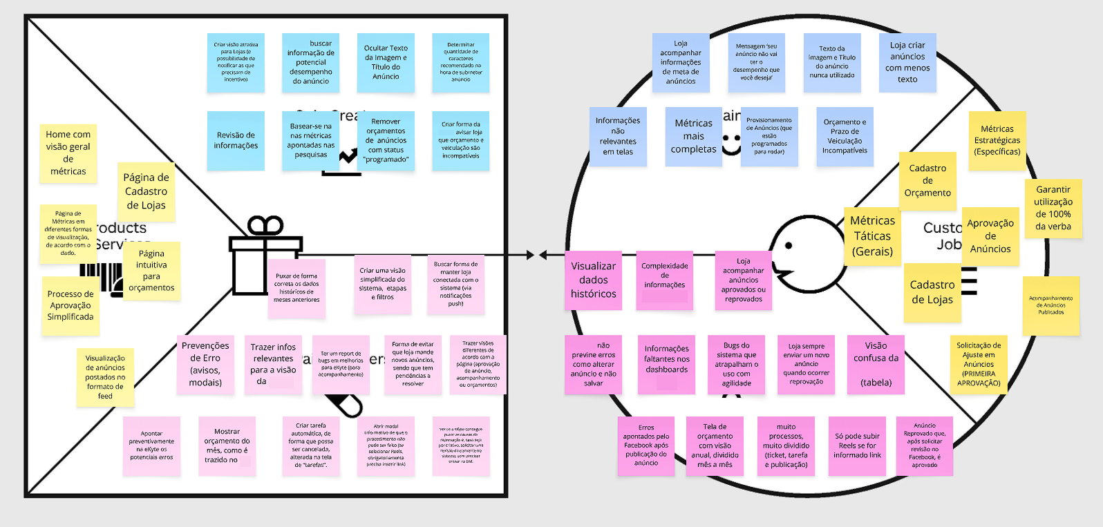
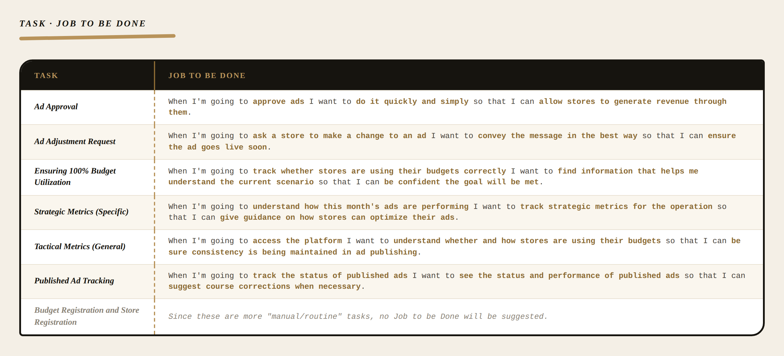
Each Marketing task became a Job to be Done — the “when I / I want / so that” structure removed the ambiguity of generic tasks like “track metrics” and forced naming the real motivation behind each one:
Process & Decisions
The decision that cost me the most was the three distinct homes — the worry was that building separate experiences per role would create friction for anyone who, in practice, wore more than one hat. A regional manager who also tracked their own ads wouldn’t feel at home in either view.
1. Role-based information architecture — problem: a single information architecture for three profiles forced every user to ignore most of the system. Options: preference-based personalization (user chooses what to see — more flexible, more complex to maintain) vs. fixed role-based architecture (routes and screens defined at login — simpler, more appropriate for a corporate context). Choice: differentiated information architecture per role, with distinct lateral navigation for each — Marketing (Home, Approvals, Panel, Metrics, Budget, Register, Notifications), Traffic Managers (Home, Reports, Feed, New, Submissions, Notifications), and Store Owners (Home, New, My Submissions, Feed, Notifications). Why: each profile’s context is mutually exclusive — mixing them on a single screen harms all three.
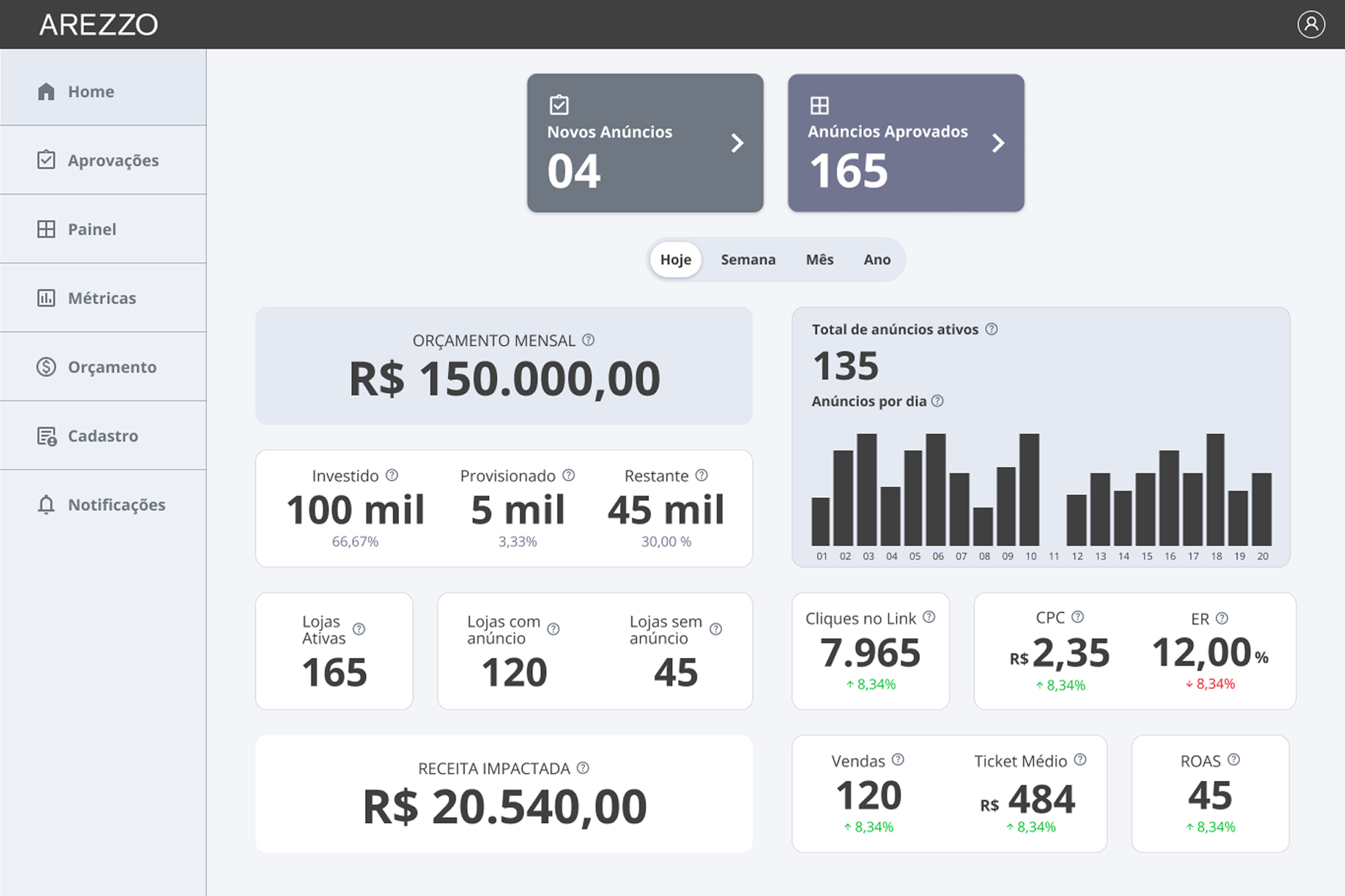
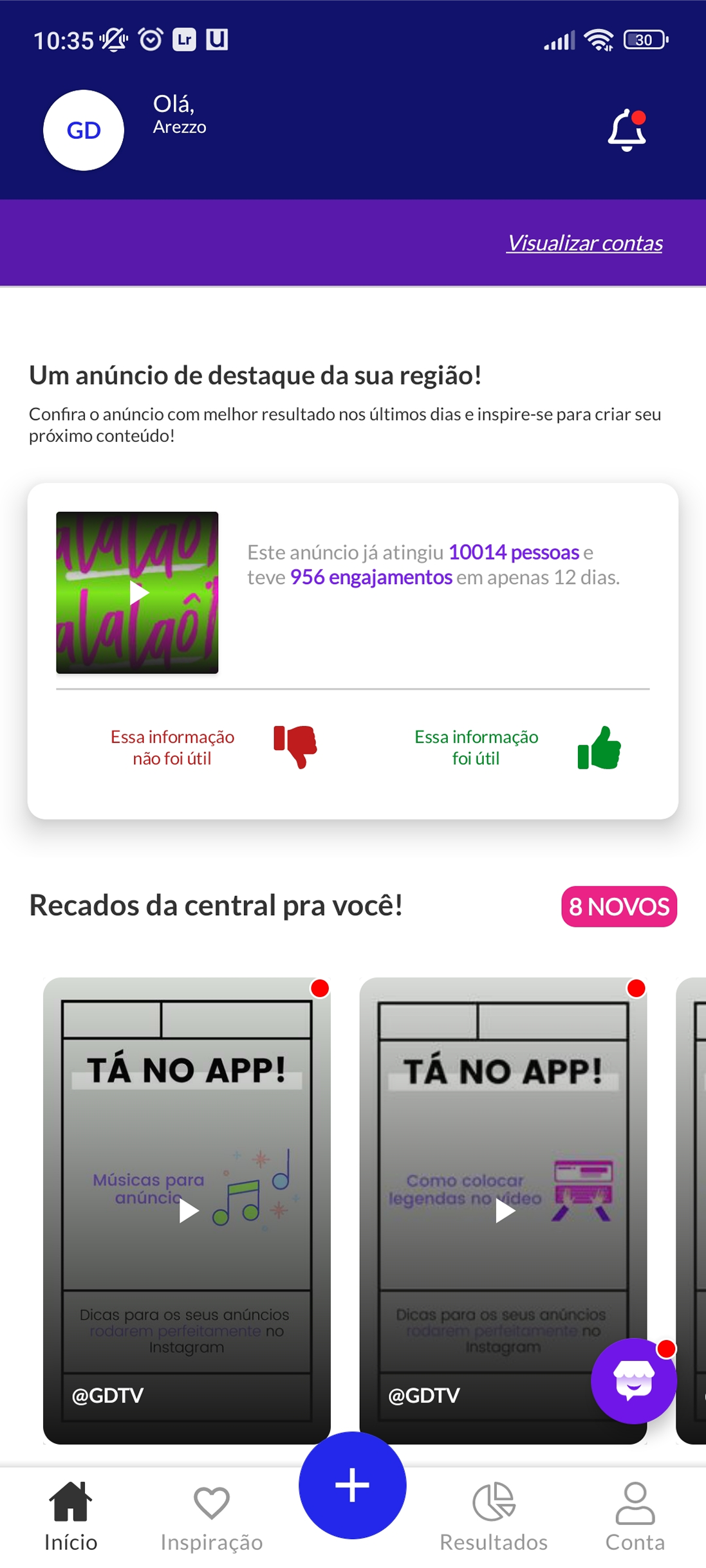
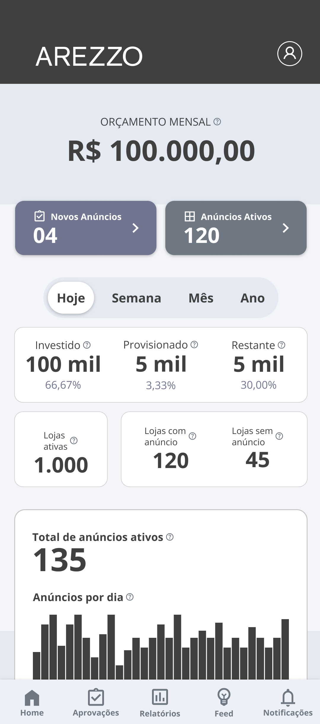
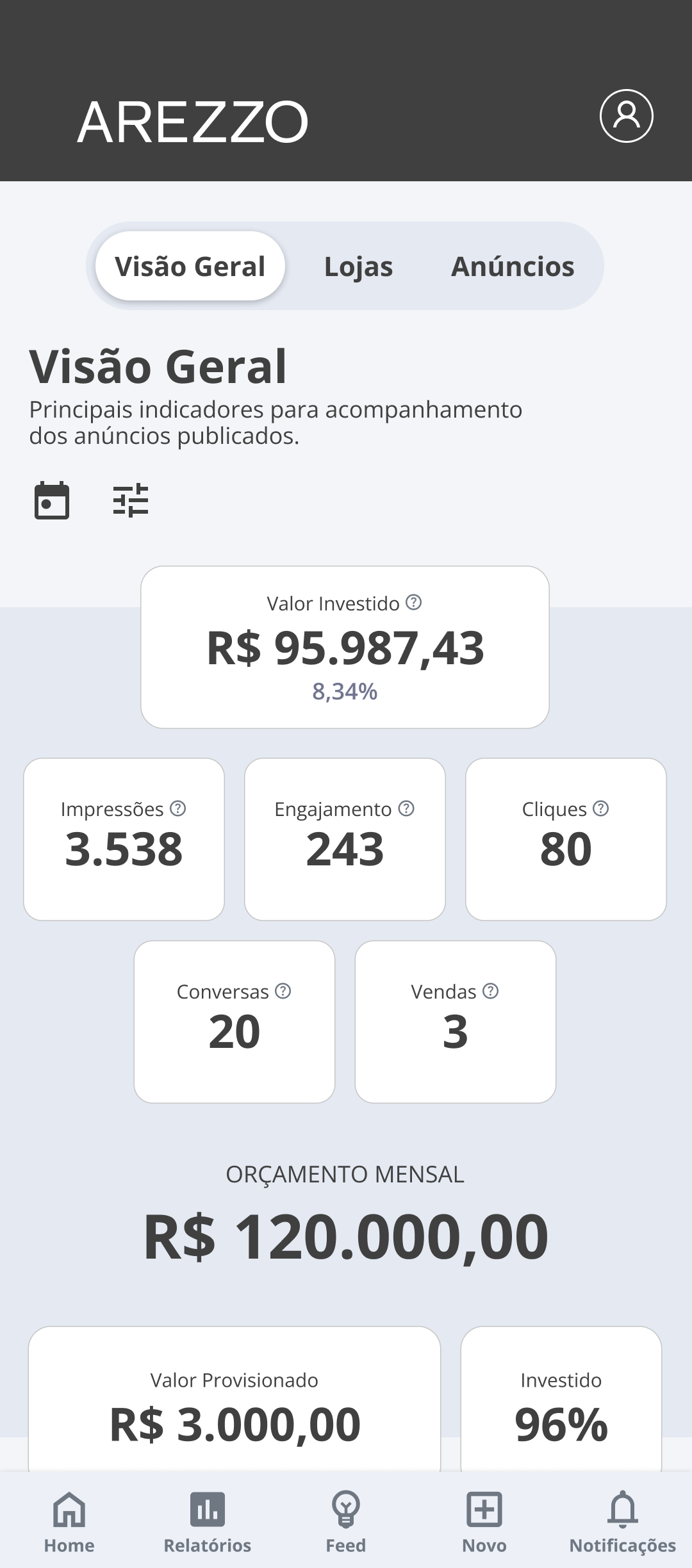
2. Home as a contextual control panel — problem: the home needed to answer different questions for each profile without becoming a generic, useless screen. Options: single home with role filters (complex, confusing) vs. three distinct homes optimized for each role’s primary task. Choice: differentiated homes — Marketing saw consolidated budget, investment distribution (Invested/Provisioned/Remaining), active store performance metrics, and Revenue Impacted; Traffic Managers saw the stores they were responsible for, focused on tactical decisions; Store Owners saw their available balance, their active ads with inline results, and an alert banner when budget was unused. Why: the home was the first screen of every session — it needed to immediately answer each profile’s most frequent question without requiring navigation.
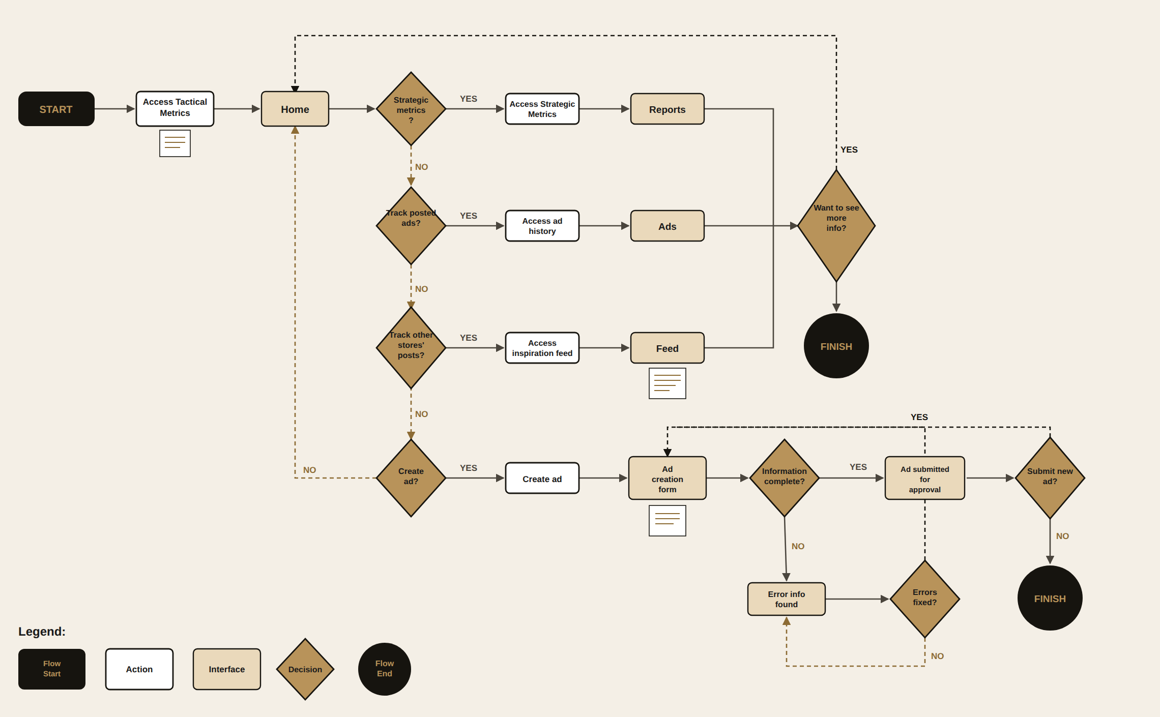
3. Approval workflow with compound filters — problem: Traffic Managers received ads from multiple stores simultaneously; without efficient filtering, the approval queue became noise. Options: linear list with simple search vs. visual grid with compound filters (Store, Status, Budget, Positioning, Archive) and quick-access chips. Choice: ad grid with cascading filters — selecting “Status” revealed sub-statuses with counts (New: 5, Approved: 10, Rejected: 2); date, active status, and ordering chips always visible at the top. Why: the Traffic Manager needed to prioritize the queue, not just scroll through it — seeing counts by status before filtering allowed a decision about where to start.
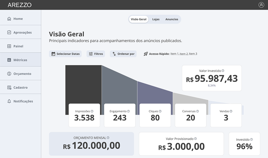
4. Funnel metrics for Marketing — the first wireframes had isolated KPI cards. Revenue Impacted. ROAS. Average Ticket. Each number in its own box. I did an internal presentation and the feedback was too polite to be honest — people agreed it was “clear” but couldn’t say what the dashboard actually said about ad health.
The problem was that isolated cards showed state, not relationship. What Marketing needed to understand was: where did the chain lose efficiency? “Conversations: 20” didn’t answer that. “Impressions 3,538 → Conversations 20” did. I replaced the cards with a visual funnel (Impressions → Engagement → Clicks → Conversations → Sales) — the KPI cards stayed as complement, not protagonist.
Research and design pipeline: per-profile interviews → journey mapping + benchmarking → role-based information architecture → Figma wireframes → internal validations → web + mobile interfaces → prototyping → handoff to partner technology company. The role-based information architecture phase happened before any screen was designed — defining which routes and modules existed per role was what made it possible to develop the interfaces without rework.
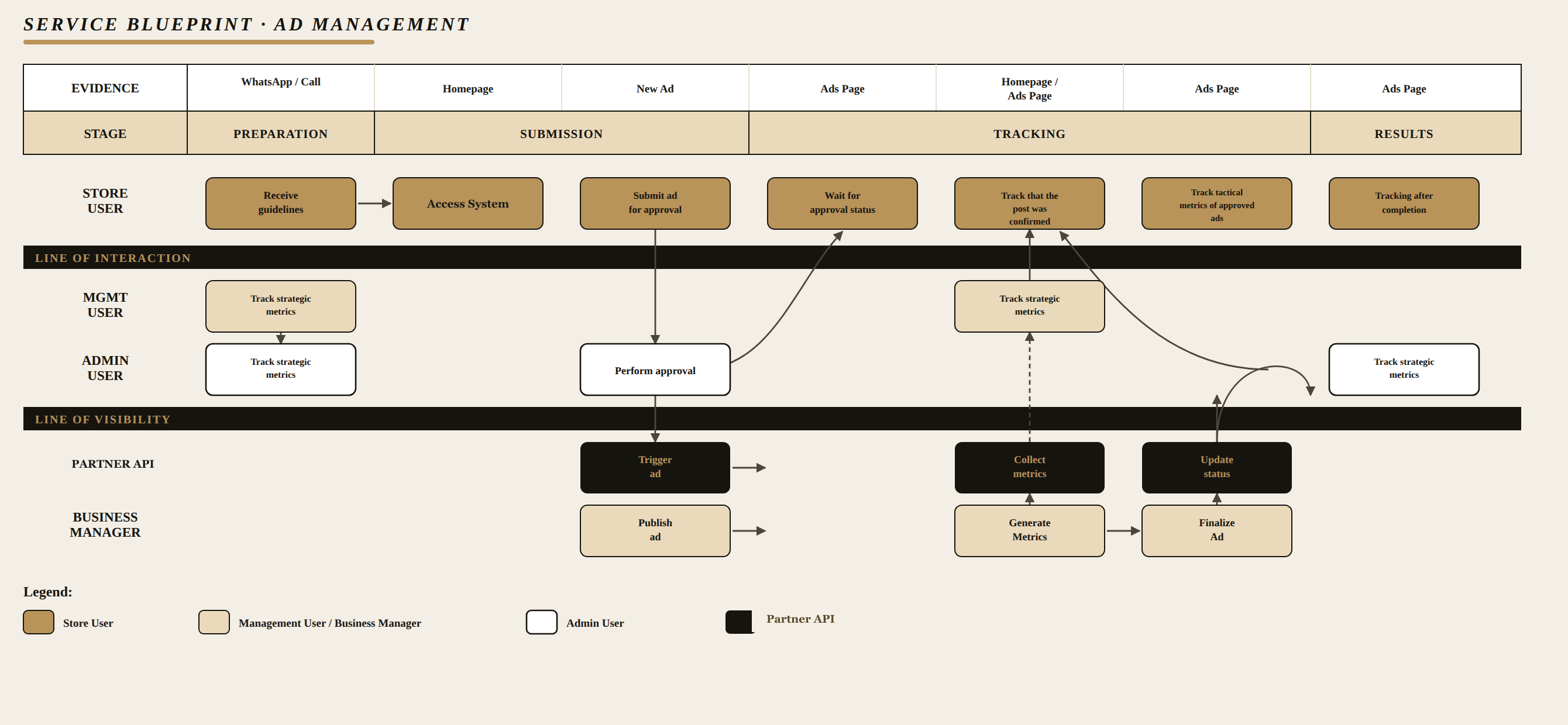
The service blueprint made visible what no single screen showed on its own: the ad created by the Store Owner went through Admin approval, integration with the partner company’s API, and the Business Manager before coming back as a metric on the Store Owner’s own screen — a cycle spanning 4 different layers of visibility.
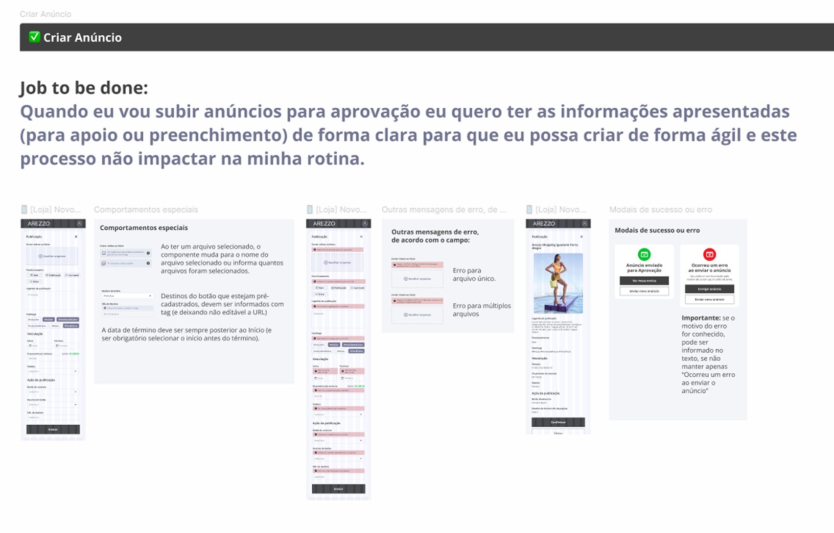
The handoff itself was documented screen by screen: each flow shipped with the Job to be Done that originated it, wireframes annotated with special behaviors (validations, field rules, error messages specific to each file type), and success/error modals specified separately — to reduce implementation guesswork without requiring synchronous alignment on every detail.
Solution & Craft
A multi-role ad management platform with three distinct experiences within the same system:
- Store Owners created and tracked their own ads, viewed their results (engagement, clicks, generated revenue, ROAS), and were alerted when they had unused budget available.
- Traffic Managers approved or rejected ads via a filtered queue, monitored stores under their responsibility, and tracked tactical performance reports.
- Marketing accessed the consolidated panel with a conversion funnel, managed monthly budget per store with inline editing, and monitored the health of the entire brand’s ad portfolio.
All screens were delivered in web and mobile, but how much mobile polish each profile got varied — and that came straight from how each one actually used the app: Store Owners used the app almost entirely on their phone, so the flow needed to be as simple as taking a photo of the product in the store and creating the ad right there. Traffic Managers split their use almost evenly between mobile and desktop. Marketing operated mostly on desktop, with mobile as occasional support while on the move.
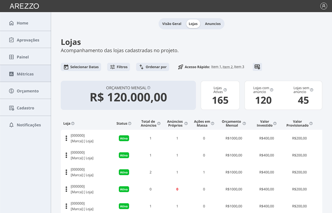
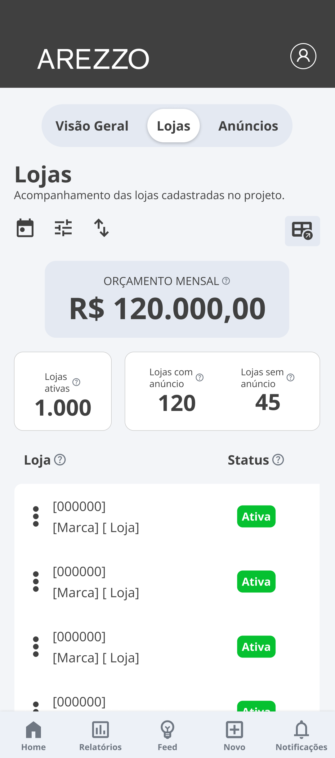
The Traffic Manager’s Stores screen is a good example of how the same information adapted to both formats, without one becoming a stripped-down version of the other:

For the Store Owner, the most visible change was foundational: the previous app was generic (same content for any profile); the new one already opens by showing what the Store Owner most wanted to see in the first second — their own balance:
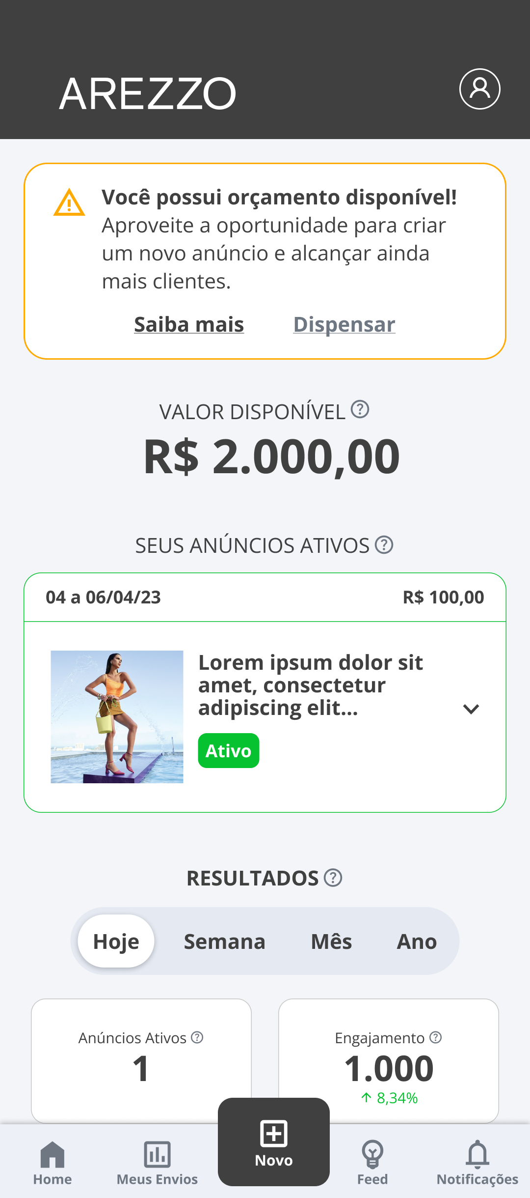
- The available budget alert banner on the Store Owner view used amber (not red — it wasn’t urgency, it was opportunity) and offered an immediate “Learn more” action without forcing interaction.
- Ad cards in the approval queue displayed status with a colored badge (orange “New”, green “Active”) + run dates + budget at the top, allowing context reading before opening the ad.
- The editable budget used inline editing triggered by a pencil icon — the field opened with the current value pre-filled and a “Confirm” button without leaving the table.
- Mobile navigation was redesigned per profile: Store Owners had “New” prominently centered in the bottom nav (their primary action); Traffic Managers had “Reports” as the first item.
- Status badges (orange “New”, green “Active”) paired color with a text label — status was readable without relying on color alone, meeting WCAG 1.4.1 for users with color-vision limitations.
Learnings
The decision that cost me most was the three distinct homes by role — the doubt was whether that would complicate life for anyone who, in practice, held more than one role. A Regional Manager who also tracked their own ads didn't fit cleanly into any of the three.
The constant pull was toward a single home with filters — the "serves everyone" shortcut. I learned that when two needs don't overlap, they cancel out: Marketing's home and the Store Owner's home couldn't share the same screen.
I delivered web and mobile interfaces for all three profiles, covering all journeys mapped in the research. Before handoff, I tested the navigable prototype with real Marketing-profile users via Maze — the test round revealed specific gaps in the contextual home, which I fixed before final delivery.

The lesson I’m taking into future projects is about the real cost of role-based architecture: three homes mean three surfaces to keep consistent as the product evolves, three places to replicate any brand or business-rule change. It pays off when the roles are genuinely mutually exclusive — and that confirmation came from real interviews with each profile, not from the designer’s assumption.
Coming in through a technology partnership brought a handoff discipline worth noting: documenting each flow with the Job to be Done that originated it, the annotated wireframes, and the error modals specified separately ensured the partner company’s team could carry the project forward autonomously — the mark of a well-made handoff is the project staying on its feet without the designer around.