When the fruit is the scenery: how I translated Del Valle’s new global identity into a digital experience with personality
TL;DR — UX and UI Designer, 1 month. Redesign of three Del Valle (Coca-Cola) pages — Home, Fruta toda hora, and Nossos Produtos — translating a new global visual identity (defined by another team) into wireframes and web and mobile interfaces.
Context & Problem
Del Valle launched a new global visual identity with a new palette, typographic system, and graphic language. The existing website used the previous identity and needed to be updated to reflect the new “Cheio de vida” (Full of Life) campaign — which repositioned the brand with emphasis on the Brazilian origin of its fruits, the chain of small and large producers, and the emotional connection between product and family. The challenge wasn’t building an identity from scratch: it was faithfully translating a personality-rich campaign into a functional website without emptying its expressiveness in the digitization process.
I came in as UX and UI Designer responsible for translating that identity into product — the only designer inside a team of developers — studying the visual identity manual and campaign references, defining the information architecture for the pages, and developing wireframes and interfaces (web and mobile) in Figma over 1 month. Three content pages delivered: Home, “Fruta toda hora”, and “Nossos Produtos” — the latter linking out to the store (external e-commerce).
The creative space was constrained from the start: color, typography, and graphic language decisions came from Coca-Cola/Del Valle’s global manual — freedom was in the translation, not in creating the system. And the campaign was visually rich, which meant the site had to be navigable without suffocating the identity with excessive caution.
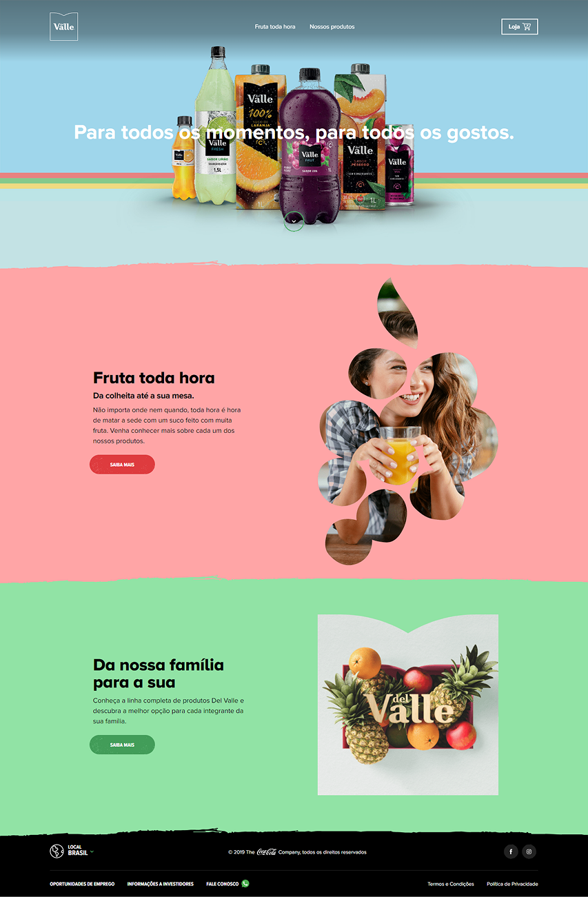
Prior state: site on the previous identity, visually disconnected from the new campaign and without the fruit-origin narrative that the new brand positioning intended to communicate.
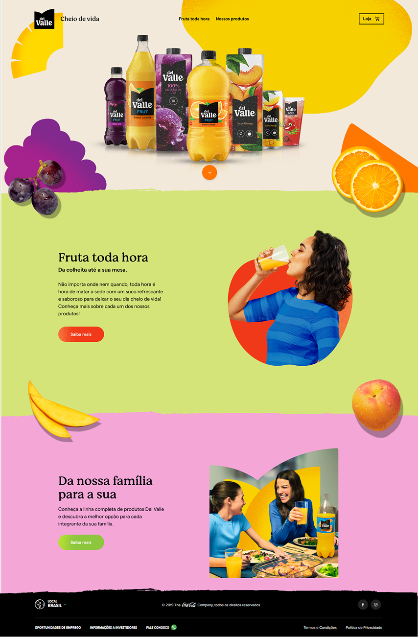
Before and After: the site pre- and post-redesign.
Discovery & Insight
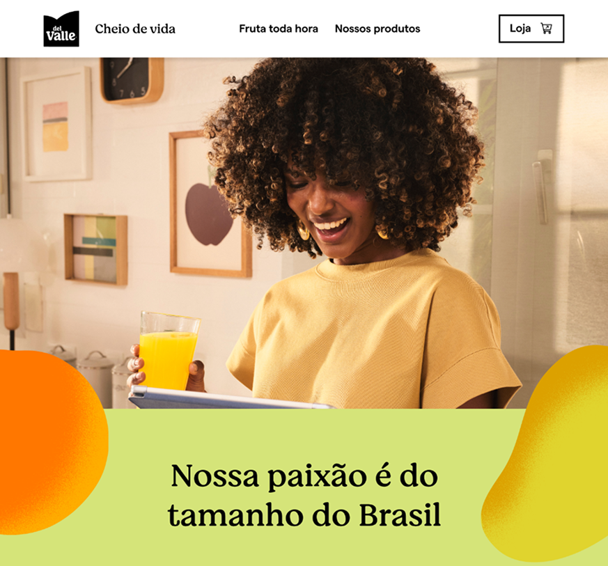
The identity manual featured organic shapes, a palette associating colors with each fruit, and a brand positioning centered on Brazilian origin. The insight came from studying the campaign references: the campaign wanted to communicate sensoriality — smell, freshness, taste — through a medium that offered none of those experiences directly. The answer was in the fruits themselves: using them as full-scale visual protagonists, not reduced to icons, and letting irregular organic shapes reflect the natural imperfection of the product — the opposite of the clinical aesthetic common in industrial beverage sites.
The turning point: the site couldn’t be a product showcase. It needed to have the texture and temperature of fruit — and that depended on precise visual decisions, not on more features.
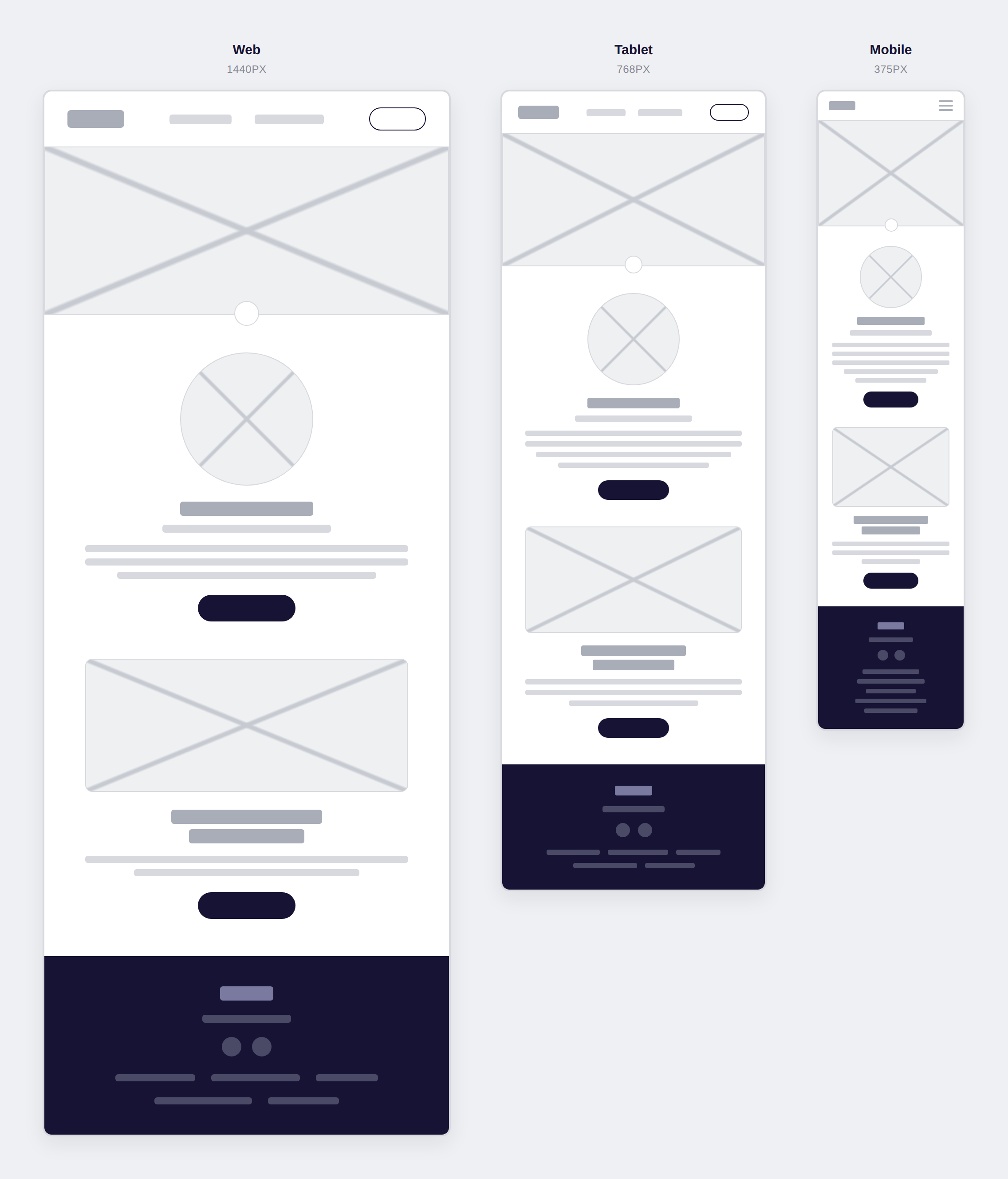
From there straight into wireframes — web, tablet, and mobile were born together, not in sequence:
Process & Decisions
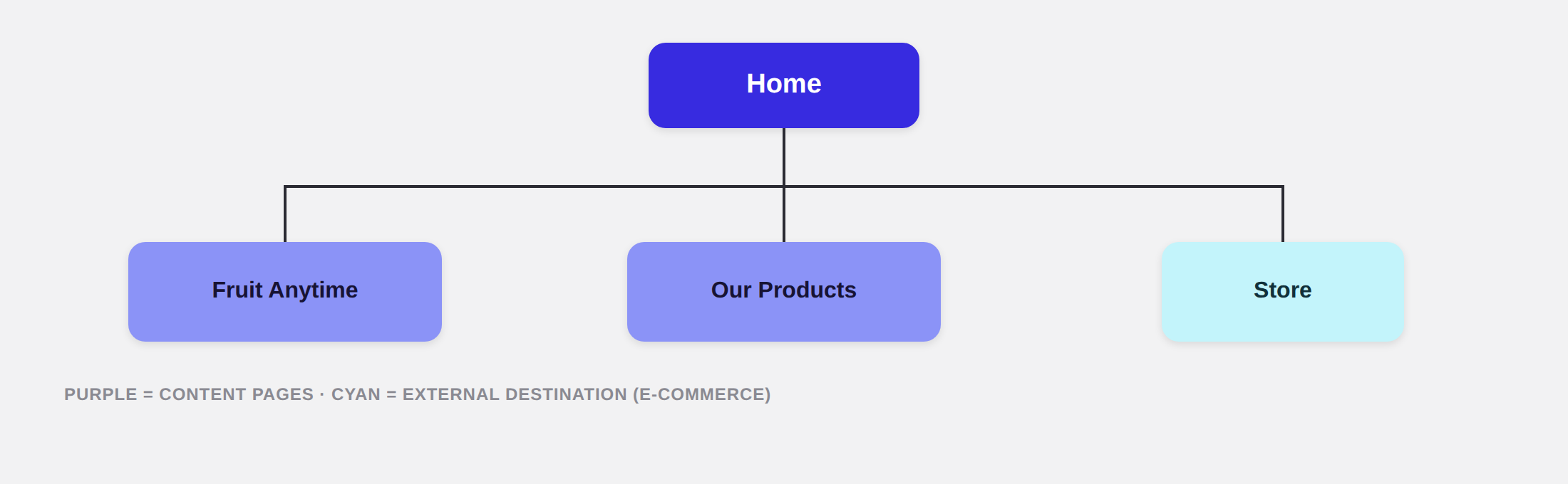
The sitemap stayed deliberately simple — just three content pages, no unnecessary depth, with the store treated as an external destination rather than a checkout flow built into the site:
The hardest part of that month wasn’t any screen-level decision — it was the pace. Creation, technical validation with the dev team, and validation with the brand’s stakeholders all had to happen nearly in parallel to fit the timeline, without any of the three becoming a bottleneck for the others.
Worth recording what wasn’t my call too, so I don’t inflate what isn’t mine: the content split across the three pages was already defined when I joined — my job was applying the new identity on top of that architecture, not designing it from scratch. The choice of which hero shows product and which shows lifestyle (Home vs. Fruta toda hora) also came from the client, not from me.
From the outside, a rebrand tends to read as a reskin — swap the color and the font on top of a structure that already exists. But that’s exactly the kind of project that gives a senior designer room to fix friction nobody’s watching, because the client’s whole attention is on the visual identity, not the navigation. It doesn’t change the product or the roadmap, but it makes room to apply usability guidelines that a bigger overhaul wouldn’t have the budget to justify on its own. Here it showed up in something small and concrete: the store was an external link (it left the site for another domain), so it was designed as an outlined button with a cart icon, different from the other menu items — people knew, before clicking, that they were about to leave the Del Valle experience. Nobody would notice that as a design decision; they’d only notice its absence if they clicked without meaning to and ended up lost in a third-party store.
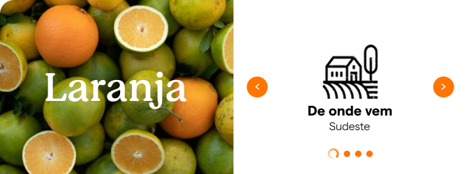
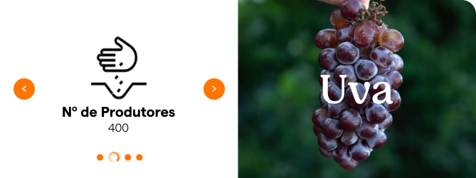
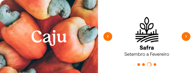
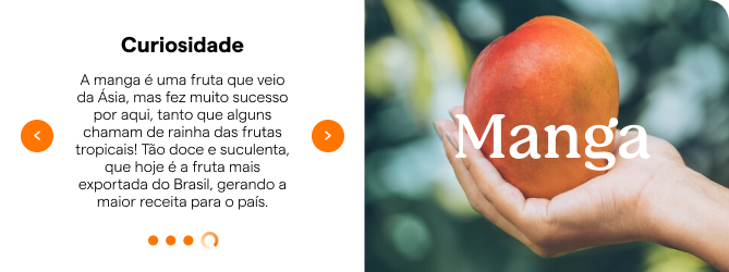
1. Alternating grid with a 4-dimension carousel — problem: each fruit had multiple information dimensions (geographic origin, number of producers, harvest period, fun fact). Displaying everything at once would weigh down the page; showing only the photo would be superficial. Options: fixed text below each fruit vs. card carousel with one dimension per screen. Choice: alternating grid — each fruit got a full-screen photo cell and a white card cell that cycled through 4 dimensions (Where it comes from / Number of Producers / Harvest season / Curiosity), with an illustrated icon and navigation dots. Why: the carousel invited exploration without forcing reading — those who wanted the origin navigated; those who just wanted to see the fruit, saw it.
Solution & Craft
Redesigned site across three content pages, with a unified visual system:
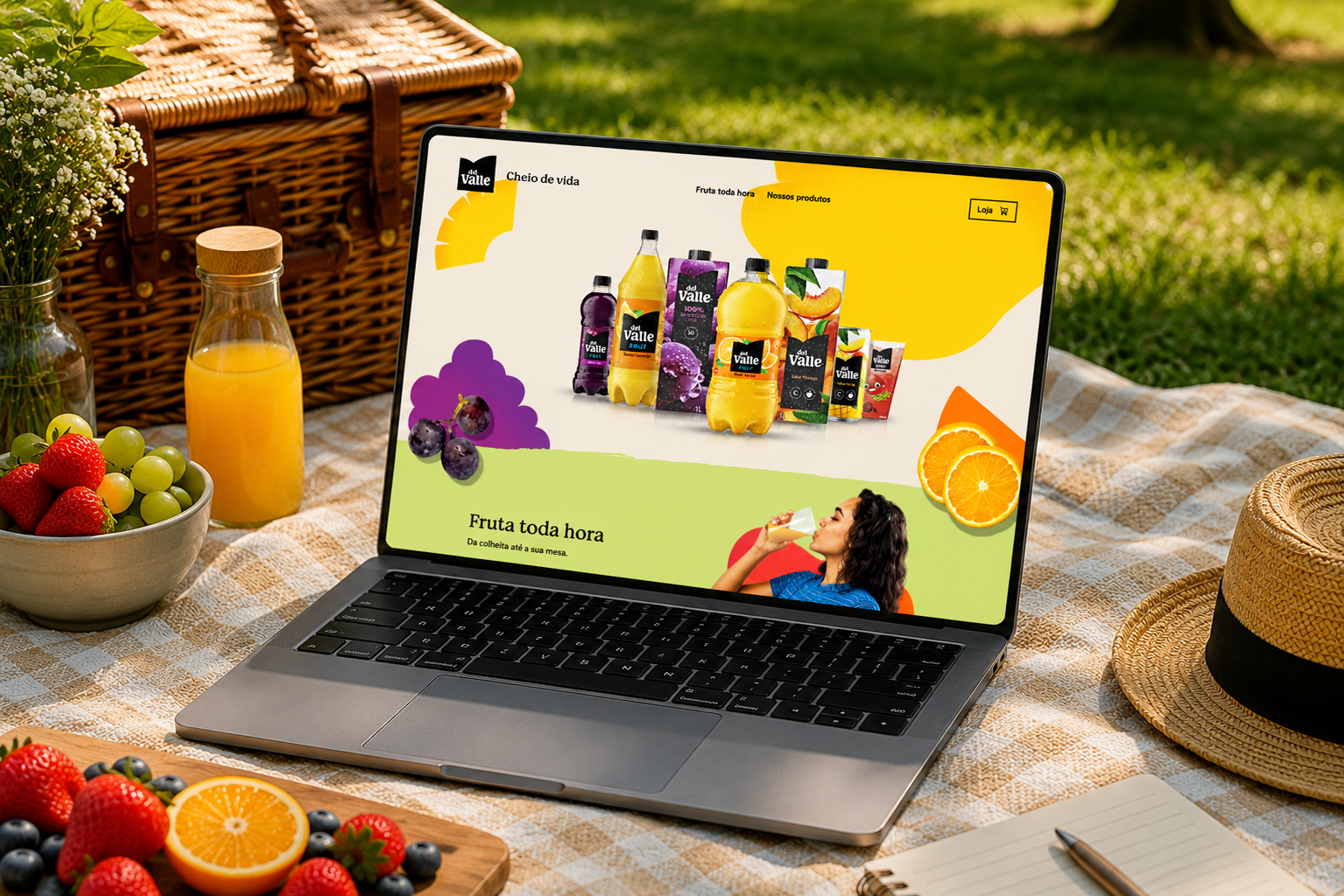
- Home: hero with the full product lineup on a cream background, colorful blobs, and real cut fruits placed organically + a “Fruta toda hora” teaser section in green with a circular-cropped photo + “Da nossa família para a sua” section in pink.
- Fruta toda hora (the page, not the Home teaser section): lifestyle hero + institutional section in lime green (“Nossa paixão é do tamanho do Brasil”) + fruit exploration grid with a 4-dimension carousel per fruit.
- Nossos Produtos: full catalog with a direct link out to the store.
The exploration grid was the page’s real hook — each fruit got a full-screen photo cell next to a white card that cycled through 4 dimensions (Where it comes from / Number of Producers / Harvest season / Curiosity):
The 4 cards below showed how the carousel cycled through dimensions, fruit by fruit:
All delivered in web and mobile, with organic graphic elements reorganized for each breakpoint — the sequence below showed the Home scroll, from the hero through the “Da nossa família para a sua” section:
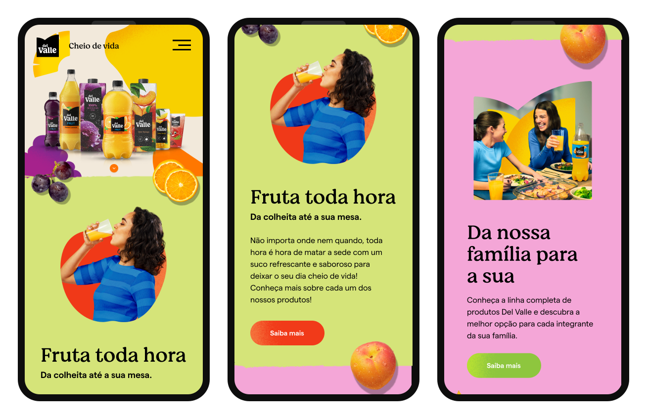
- Organic blobs were positioned to create depth: always partially cropped by the screen edge, never centered — conveying movement and the brand extending beyond the frame.
- Real fruits were cut out and placed over the corresponding color blob (oranges over orange blob, grapes over purple blob), creating consistent fruit-color association without needing labels.
- In Home’s “Fruta toda hora” teaser section, the lifestyle photo was cropped in a circular shape over a red circle — consistent with the organic visual language.
- CTAs followed a per-section contrast logic: “Saiba mais” in orange on green background; “Saiba mais” in green on pink background — never a standard CTA color regardless of context.
- On mobile, the hamburger menu preserved “Cheio de vida” next to the logo; organic elements scaled proportionally without disappearing.
Learnings
The hardest part of that month wasn't any single screen decision — it was the pace: creation, technical validation with the dev team, and stakeholder validation all had to happen nearly in parallel to fit the deadline.
The content split across the three pages, and which hero shows product vs. lifestyle, were already defined when I joined — my job was applying the identity on top of that structure, not designing it from scratch.
The biggest learning from that month was realizing that clear guidelines speed things up, they don’t hold them back. With the identity manual already defined — palette, typography, tone of voice — turning a briefing into a product gets a lot faster: instead of spending time deciding “which color works,” the job becomes structuring hierarchy, flow, and content on top of a base the brand has already validated. It’s a bit counterintuitive if you assume constraints get in the way — but that clarity was exactly what made it possible to deliver three complete pages, in web and mobile, in a single month, with technical and stakeholder validation happening in parallel.
The other thing that stuck with me was the weight of the scale. Del Valle is a 77-year-old brand present in over 100 markets — working on this project wasn’t just about drawing a nice screen, it was knowing that every wireframe decision would run inside an identity that represents the brand at a national level. I came in as the only designer inside a team of developers, and that responsibility — being the one translating a brand guideline of that size into an interface that actually ships — weighed more than any single layout decision.