
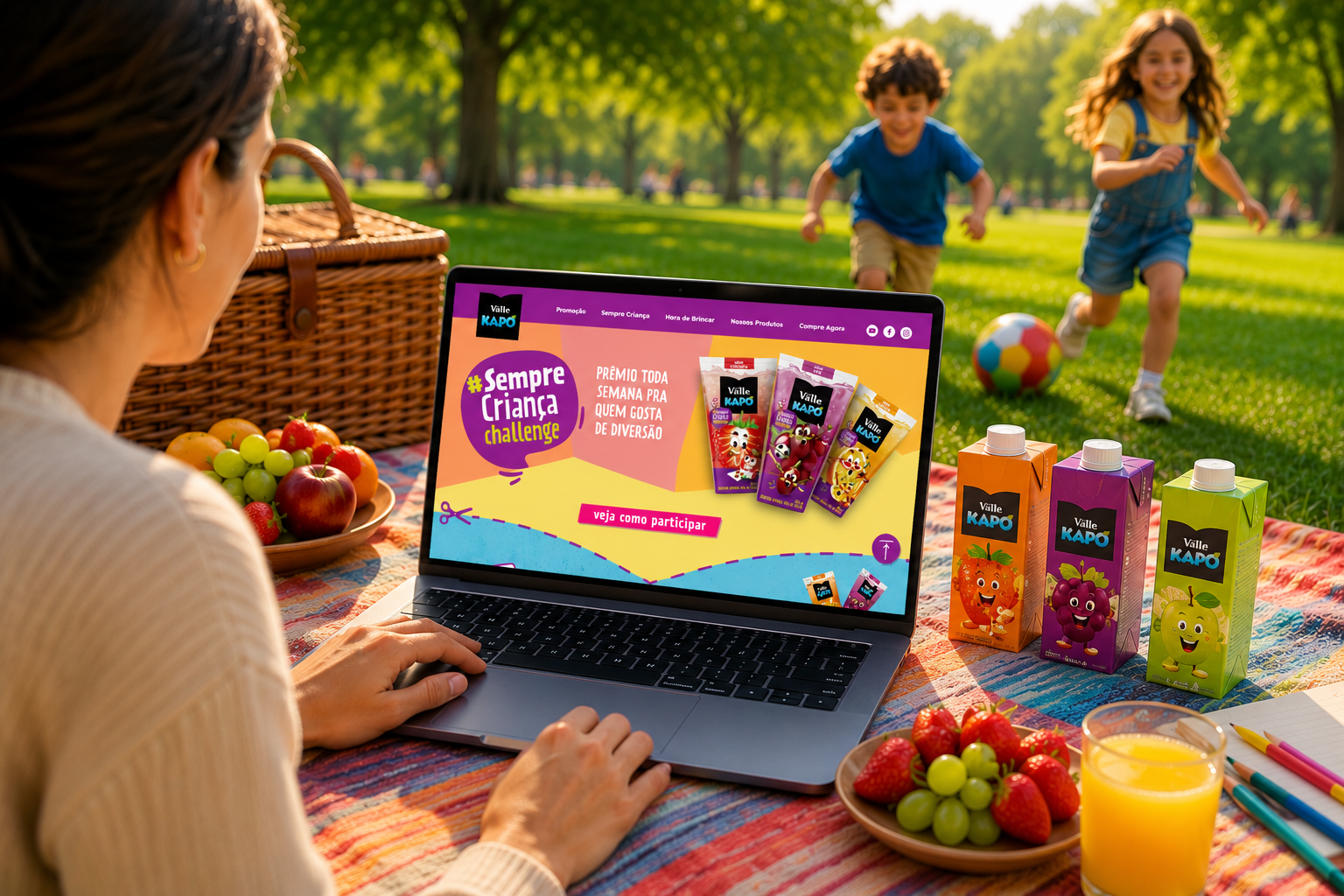
Summary: for Q3 2022, Kapo — Coca-Cola’s leading kids’ juice brand — was continuing to build a brand position around being the perfect companion for kids’ downtime with their parents and grandparents, under the concept “Toda Brincadeira gera Frutos” (Every Playtime Bears Fruit). The brand brought in CWI, through its Coca-Cola development unit, to redesign the brand’s main site, plus a dedicated site for the “Sempre Criança Challenge” campaign, built to drive user-generated play videos through weekly prizes.
CONTEXT
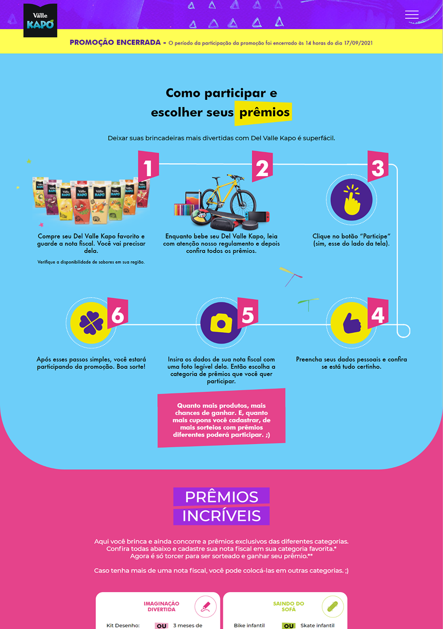
Del Valle Kapo is a product aimed at children and families, with a brand positioning that goes beyond juice: the “Sempre Criança” (Always a Child) campaign positioned the brand as a promoter of play and childhood. The kapo.com.br site needed to be redesigned for the new Children’s Day 2022 campaign — but the scope went beyond updating colors and images. It required deciding which pages the site should have after the redesign, in line with the new campaign and the upcoming promotion.
As part of CWI, I joined the project as UX, UI, and Visual Designer responsible for the full project — the only designer inside a team of developers — using the “Sempre Criança 2.0” and “Sempre Criança Challenge” campaign materials to guide information architecture decisions, referencing the nuances of the new campaign visual identity, creating illustrations and graphic elements, and developing all interfaces (web and mobile) in Figma, Photoshop, and Illustrator over 3 months.
The “Sempre Criança 2.0” campaign came with pre-defined assets, palette, and tone of voice — creative freedom was in the digital translation, not in identity creation — and the site had to serve both children browsing for activities and parents and grandparents who bought the product and joined promotions, which meant content hierarchy had to serve both journeys at once.
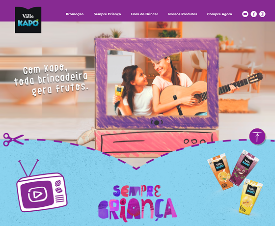
Before and After: the site’s scenario pre- and post-redesign.
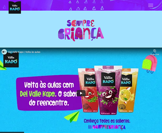
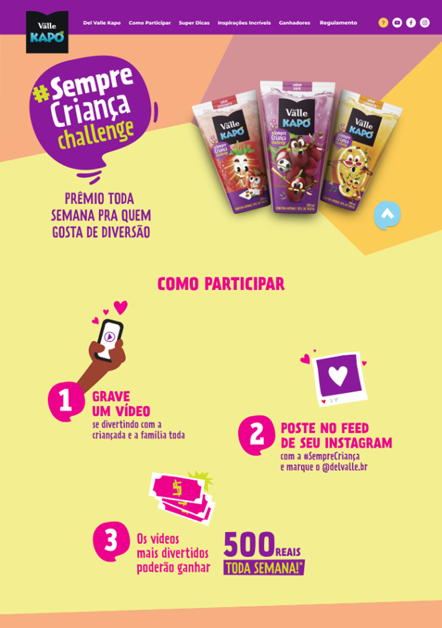
The project’s second site was the “Sempre Criança Challenge” campaign microsite: a 3-step mechanic (record a video playing as a family, post it on Instagram with the hashtag, compete for R$500 every week), with prizes, rules, and a weekly winners list.
The same before/after applies to this second site:
Discovery & Insight
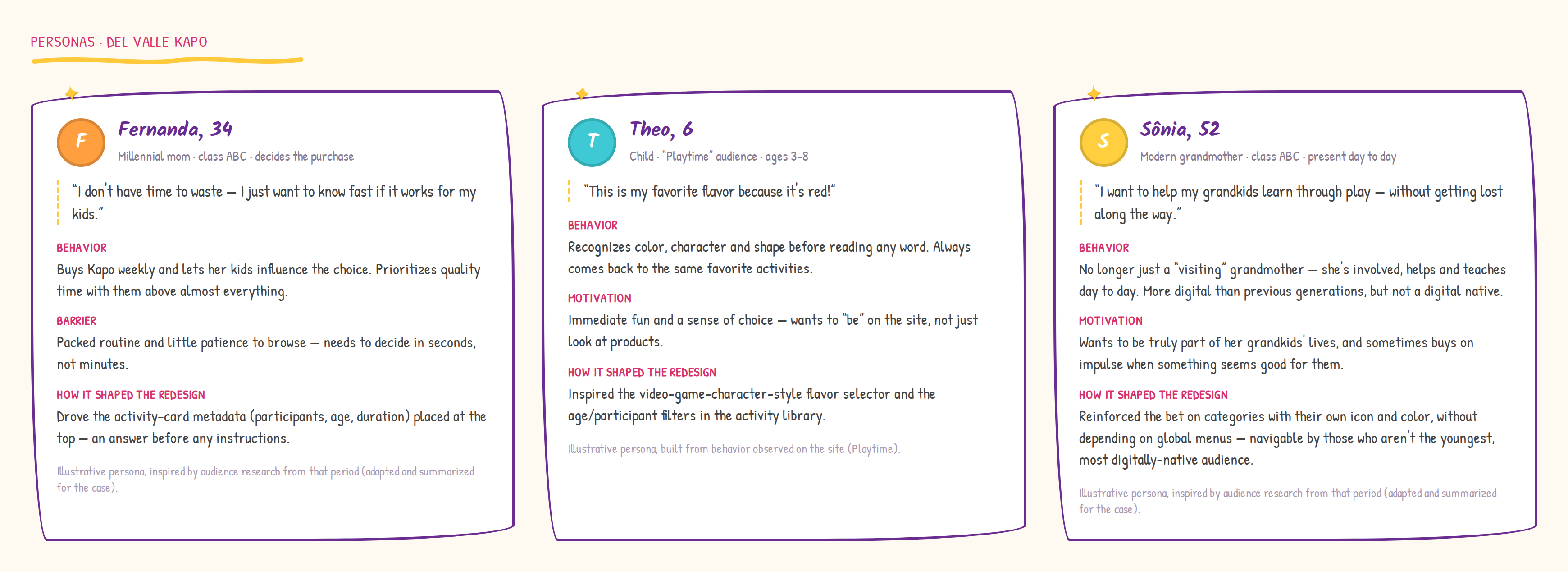
The personas’ behavior revealed something the original campaign hadn’t anticipated: the “Hora de Brincar” (Playtime) section — the site’s activity repository — wasn’t supporting content, it was what families actually came looking for. Fernanda decided in seconds, Theo recognized color and shape before he could read, Sônia wanted to join in without getting lost — none of the three landed on the site thinking about buying juice first.
The turning point: Kapo had unknowingly built a real digital product inside its institutional site. The redesign needed to recognize this and elevate “Hora de Brincar” to its actual position of prominence.
The three personas summarized this behavior — each one drove a different redesign decision.
Process & Decisions
The decision that cost me most was the video-game-style product selector. The metaphor made sense for kids — but it’s the parents who actually browse a product site. I kept wondering whether the video game reference would feel brilliant or strange to a 35-year-old who just wants to see which flavors are available.
1. Information architecture driven by real usage — problem: the previous site had multiple pages, and the decision of what to keep or cut in the redesign was subjective. Options: keep everything to be safe (no decision cost, more complex site) vs. cut based on how people actually used the site. Choice: I prioritized the sections with the highest observed engagement, dropping those with no real relevance and elevating “Hora de Brincar” in the navigation hierarchy. The resulting structure: Home → Promoção (Sempre Criança Challenge) → Sempre Criança (Video) → Hora de Brincar (activity repository, with its 5 thematic categories) → Nossos Produtos → Compre Agora. Why: information architecture based on real behavior is more honest — and more effective — than intuition about what “should” be on the site.
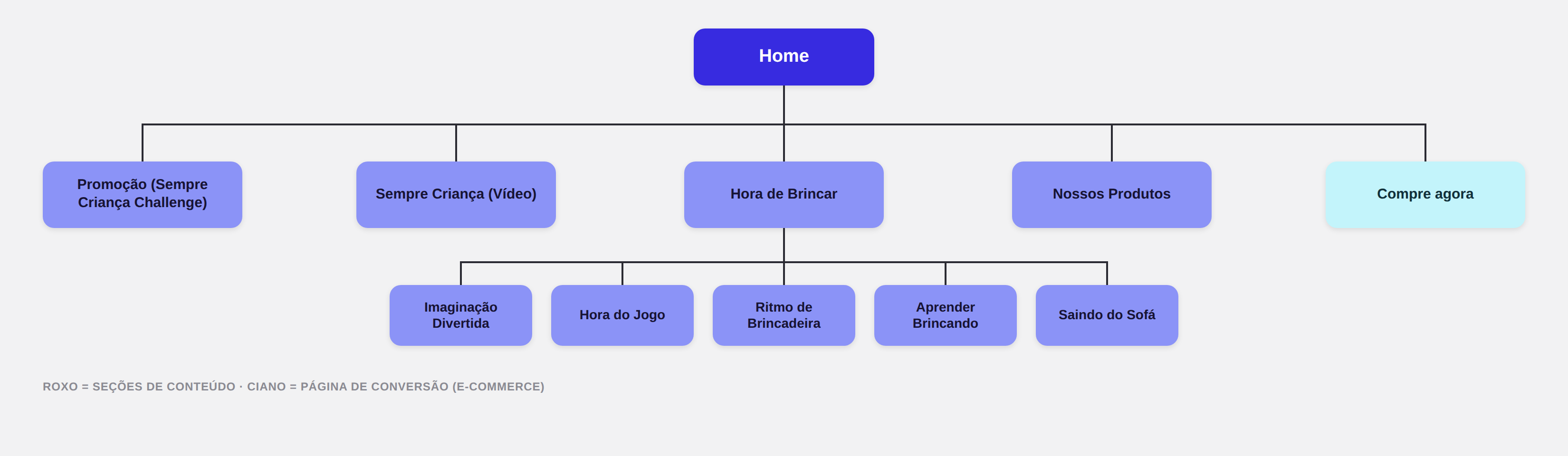
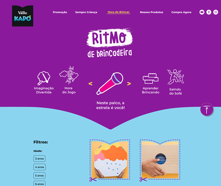
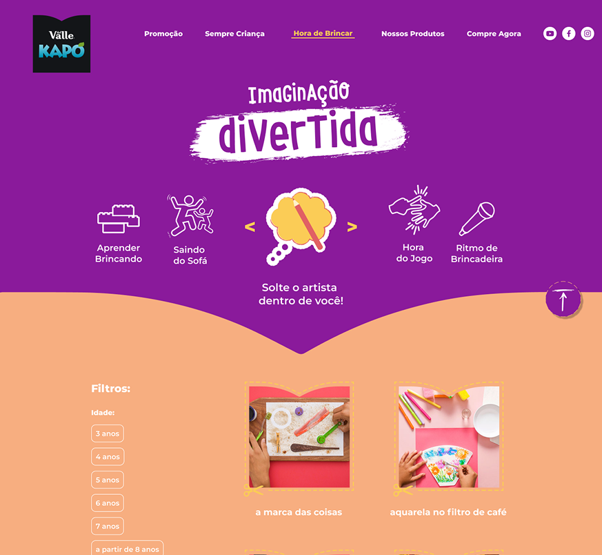
2. Hora de Brincar as a structured content system — problem: the activity repository had dozens of very different activities. Without organization, it was an undifferentiated list. Options: simple listing with text search vs. a category system by play profile with filters by age and number of participants. Choice: 5 thematic categories with distinct visual identity (Imaginação Divertida, Saindo do Sofá, Aprender Brincando, Ritmo de Brincadeira, Hora do Jogo), each with Age filters (from 3, 4, 5, 6, 7, 8 years) and Participants (pairs to 4 or more). Why: an activity for 2 people aged 4 was completely different from one for groups of 8-year-olds — without filters, the library was unusable for someone with a specific need.
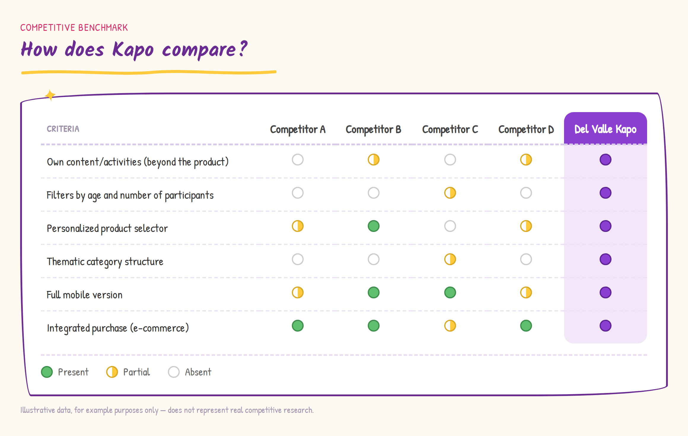
To put this choice in context, I later put together an illustrative benchmark (not formal market research) comparing Kapo to similar sites — the category structure and personalized product selector showed up as real differentiators against what competitors did only partially or not at all.
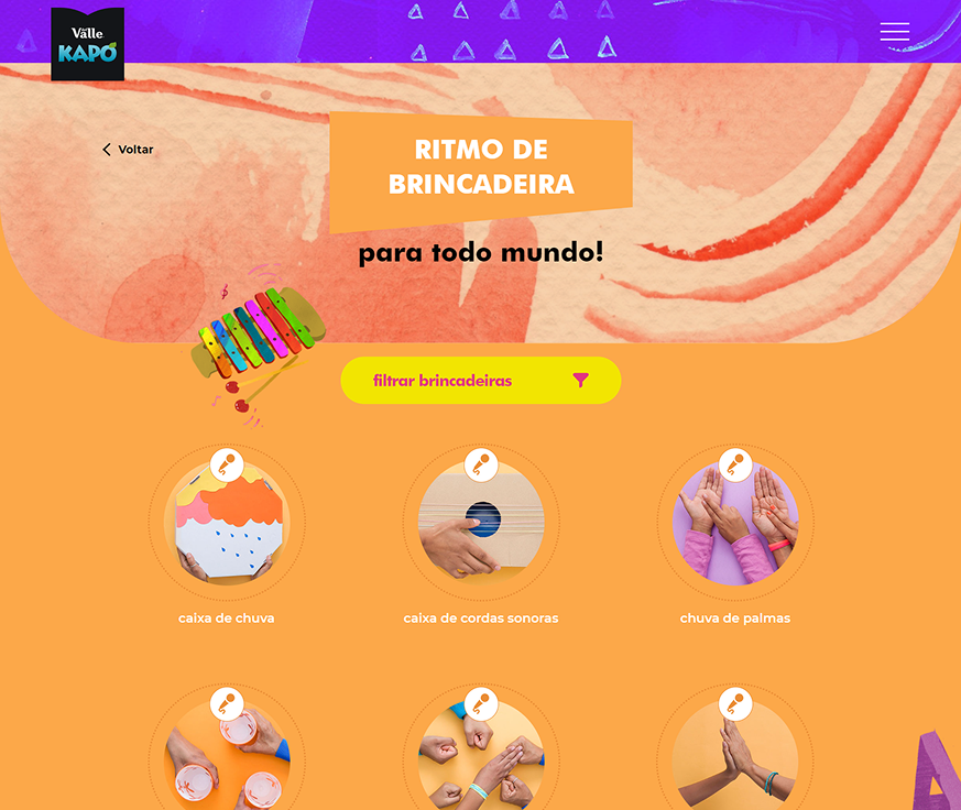
In practice, each category became its own screen — color, illustration, and side navigation between the 5 categories, always with the same age and participant filters:
3. Activity page as a structured card — problem: each activity had required materials and step-by-step instructions — the same problem as any recipe. A running-text page wouldn’t work for quick reference in the middle of the activity. Options: running text vs. structured card with metadata at top (participants, age range, duration) + fixed sections (Materials needed / How to play). Choice: activity card with metadata prominently at the top, typographically styled sections in category colors, Share / Print / Download icons at the top, and contextual Kapo product at the bottom. Why: the parent opening the page wanted to quickly see if that activity worked for their kids (participants, age) before reading any instruction — the top metadata answered that in seconds.
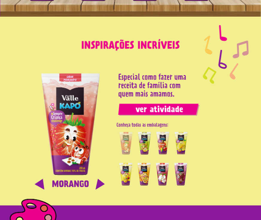
4. Two selectors, one character-selection language — the first version of the product selector was a simple grid: 5 flavors in circles, all visible at once. It worked. But it was too generic for a product positioning itself as “more play platform than product site.”
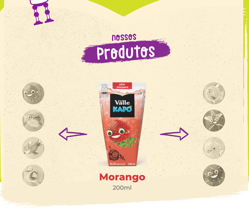
I redesigned it as a centered carousel in the style of a video game character selector — active flavor in the center, full-color and larger; others desaturated and smaller on the sides with navigation arrows. Desaturation communicated “available but not selected” without needing text. And the video game metaphor was completely familiar to kids. The adult navigating it understood too — it was the same pattern as an avatar selector.
The same pattern reappears on the campaign microsite, in the “Inspirações Incríveis” (Amazing Inspirations) section — except there, picking a flavor suggests a family activity to do with that product, instead of leading straight to a purchase. I reused the same interaction for a different goal: from choosing a product to choosing an activity.
Solution & Craft
Redesigned site with 6 main sections and a structured play platform:
-
Home: campaign hero “Com Kapo, toda brincadeira gera frutos” + cut-paper transitions into subsequent sections.
-
Promoção (Sempre Criança Challenge): entry hub for the promotion, with weekly prizes and rules, linking to the dedicated campaign microsite.
-
Sempre Criança (Video): campaign section with embedded YouTube video, “child personality” quiz, and engagement CTA.
-
Hora de Brincar: repository of 60 mapped activities across 5 thematic categories, each with its own color and identity, with age and participant filters and recipe-format activity cards.
-
Nossos Produtos: video game-style flavor selector with links to partner e-commerce stores.
-
Complete mobile version for all pages.
-
The transition between sections used wavy cut-paper edges — an undulating border that simulated torn paper directly evoked paper-cutting activities, making the visual metaphor coherent from the first to the last section.
-
Section titles used a hand-painted treatment with a brush-stroke dark splash as a text background, consistent with Kapo’s handwritten visual language.
-
Each Hora de Brincar category had its own background color, illustrated icon, and typographic treatment — creating a per-category identity system without requiring a global menu.
- In the product selector, the active flavor was full-color and centered; the others were in greyscale smaller circles on the sides — desaturation communicated “available but not selected” without text.
- The decorative scissors icon in the hero anchored the cut-paper metaphor from the very first second of browsing.
Learnings
The decision that cost me most was the video-game-style product selector — the metaphor made sense for kids, but it's the adult who browses to buy. I couldn't tell if it would land as clever or strange to a 35-year-old.
The personas revealed that "Hora de Brincar" wasn't supporting content — it was what families actually came looking for. I learned that architecture based on real behavior beats any assumption about what "should" be on the site.
I came into this project with the identity already locked — palette, mascots, tone of voice, even the “Toda Brincadeira gera Frutos” concept were ready from the campaign before I drew a single screen. That changes the kind of decision that falls to the designer: it’s not about creating an identity, it’s about translating an identity built for packaging and video into the grammar of a website, without it turning into a collage of loose assets.
The cut-paper motif was the way out I found: instead of inventing a new metaphor for section transitions, I took an element that already existed in the campaign — the idea of cutting, of making things by hand — and turned it into a system (the wavy border, repeated from top to bottom). I can’t say whether any user consciously noticed it. But it’s how I kept the brand identity present through the whole scroll, not just on the first screen.
Being the only designer inside a team of developers, a good part of the work wasn’t designing isolated screens — it was making the spec (color per category, flavor-carousel behavior, filter states) clear enough to be implemented without me being next to the dev the whole time.
What I take from this: translating a brand into a digital product is a different exercise from creating an identity from scratch. The judgment call is in knowing what to keep literal — the palette, the mascot, the voice — and what needs to gain a layer of interaction to work as a site, rather than as a longer ad.