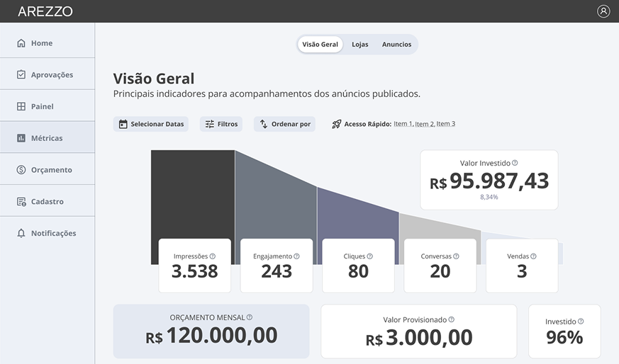

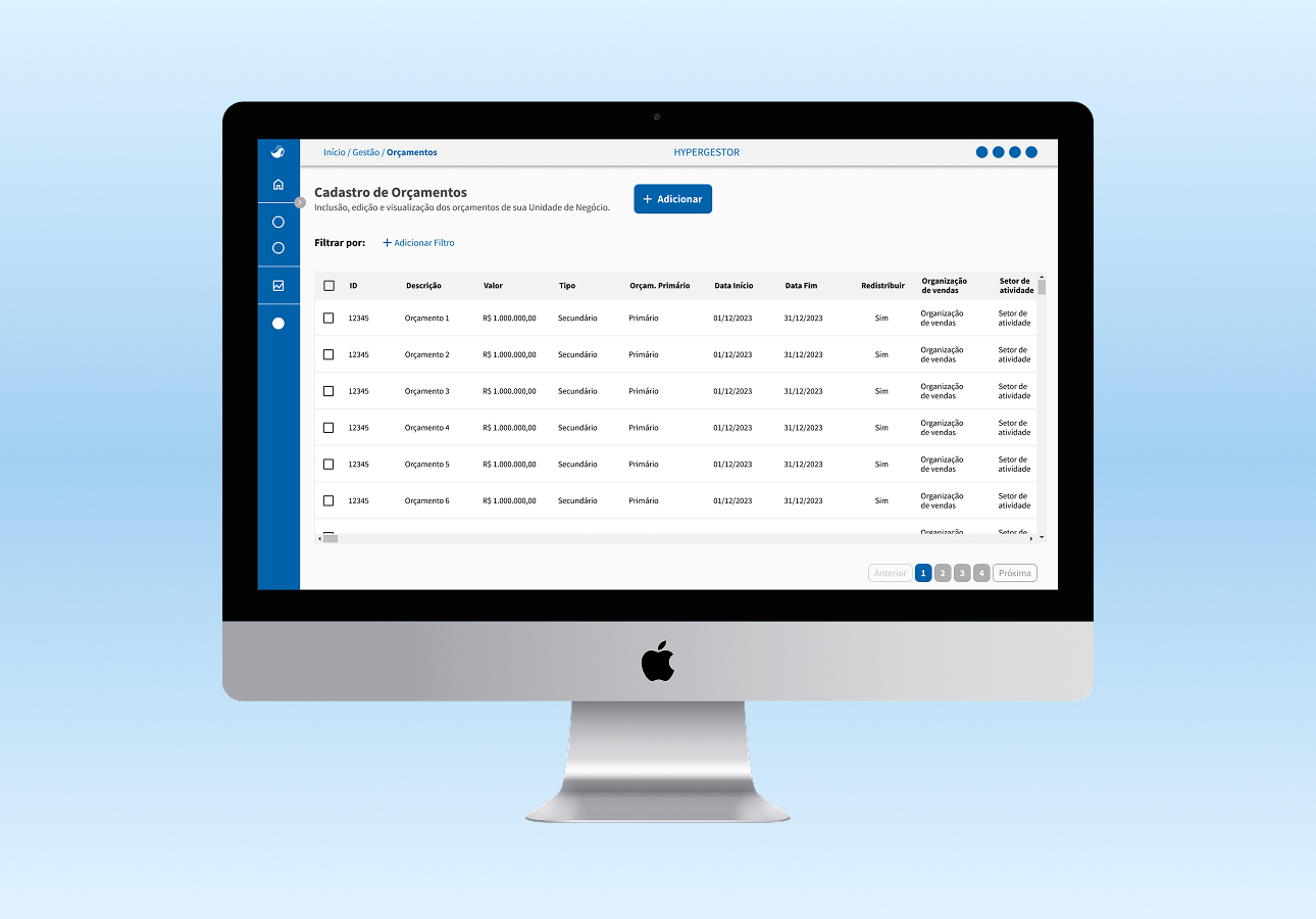
From budget to proof: how I turned Hypera Pharma’s trade marketing fund cycle into a traceable pipeline
TL;DR — UX and UI Designer, 2 months. Creation of Fund Manager, an internal budget and trade fund management system for Hypera Pharma’s trade marketing actions — centralizing into a single pipeline the flow that previously ran across spreadsheets, emails, and manual SAP/SEV integration.
Context & Problem
Hypera Pharma managed trade marketing investments at scale — funds that started from corporate budgets, were distributed through the sales hierarchy (region → office → team → supervisor → sales rep), and had to be verified with evidence before integrating into SAP. Without a centralized system, every step of this cycle happened in isolation: budget creation was manual, fund distribution depended on emails between departments, and investment verification was done outside the system, with no traceability.
I came in as UX and UI Designer responsible for the complete Fund Manager design — mapping the journeys of each user profile involved in the cycle, defining the information architecture, designing all interfaces and prototypes in Figma, and collaborating with the development team on Azure over 2 months. The design had to respect Hypera Pharma’s brand guidelines.
Three constraints shaped the work: the cascading fund hierarchy (primary budgets → secondary budgets → multiple levels of sales hierarchy) had to be represented without creating confusion; the SAP/SEV integration required an explicit gate before releasing data to SAP, to avoid errors with real financial impact; and a 2-month timeline covered mapping, designing, and prototyping a multi-module, multi-profile system.
Of the scope mapped over these 2 months, three modules actually made it to production in this cycle — Company Registration, Fund Verification and Proof, and SAP Integration Approval. Parameterization, login/SSO, and reports stayed mapped, but outside the initial build.
Prior state: spreadsheets scattered across the company, with no end-to-end visibility of the trade marketing cycle.
Discovery & Insight
Journey mapping revealed that the problem wasn’t any single step in isolation — it was the absence of a connected cycle. Budgets were created in one place, funds allocated in another, distributions communicated by email, and verification done with loose evidence files unlinked to the original planning. The result: no one had complete visibility into how a trade marketing investment had been planned, distributed, and executed.
The turning point: Fund Manager didn’t need to be a collection of forms. It needed to be a pipeline — each step feeding the next, with traceability from budget all the way to evidence-backed verification.
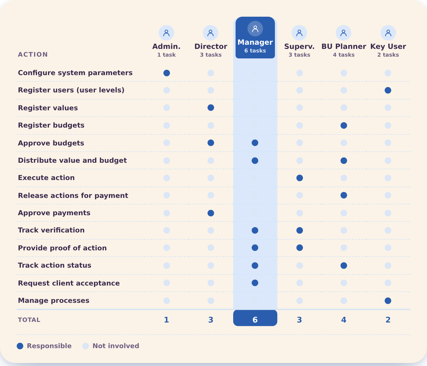
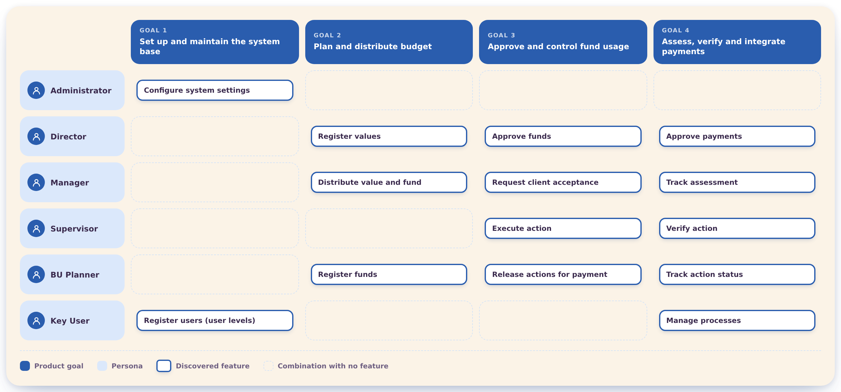
Crossing the 6 profiles with the product’s 4 goals (set up the system base, plan and distribute budget, approve and control fund usage, assess/verify/integrate payments) was what revealed which features each profile actually needed — and which profile × goal combinations simply didn’t exist:
Process & Decisions
The decision that weighed on me most was the SAP release checkpoint. The product would be faster and less friction-heavy without that confirmation gate. And the more friction you add, the higher the adoption resistance risk. The question was: what level of deliberation is design, and what level is obstacle?
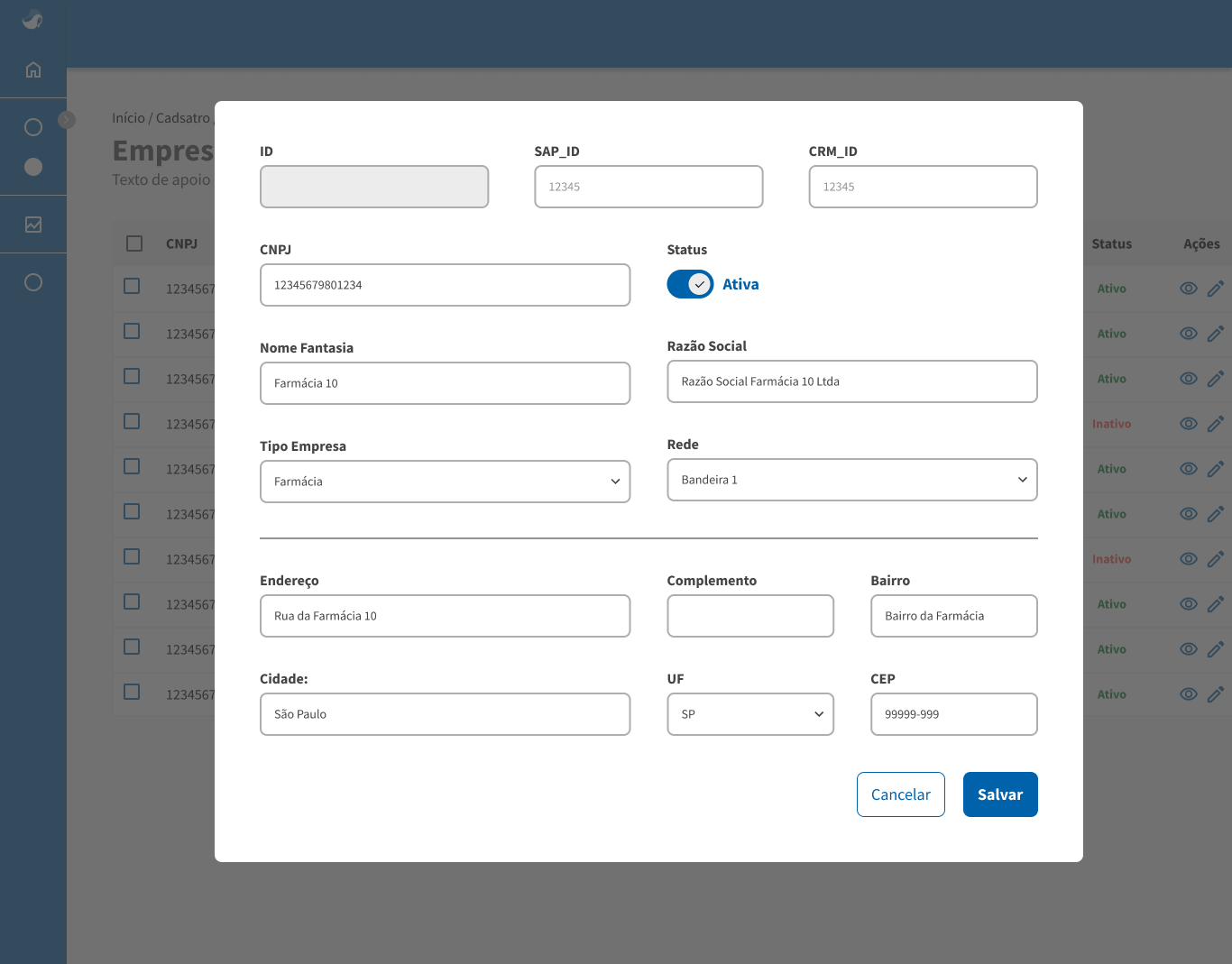
1. Modal vs. dedicated page for company registration — problem: company registration (distributor, pharmacy, etc.) had many fields — ID, SAP_ID, CRM_ID, CNPJ, status, type, address; navigating to a new page would lose list context. Options: navigate to a dedicated page (more space, loses context) vs. modal overlay on the listing (maintains context, requires internal scroll). Choice: persistent modal over the listing for creation and editing. Why: users frequently needed to reference other companies in the list while registering a new one — the modal allowed this without additional navigation.
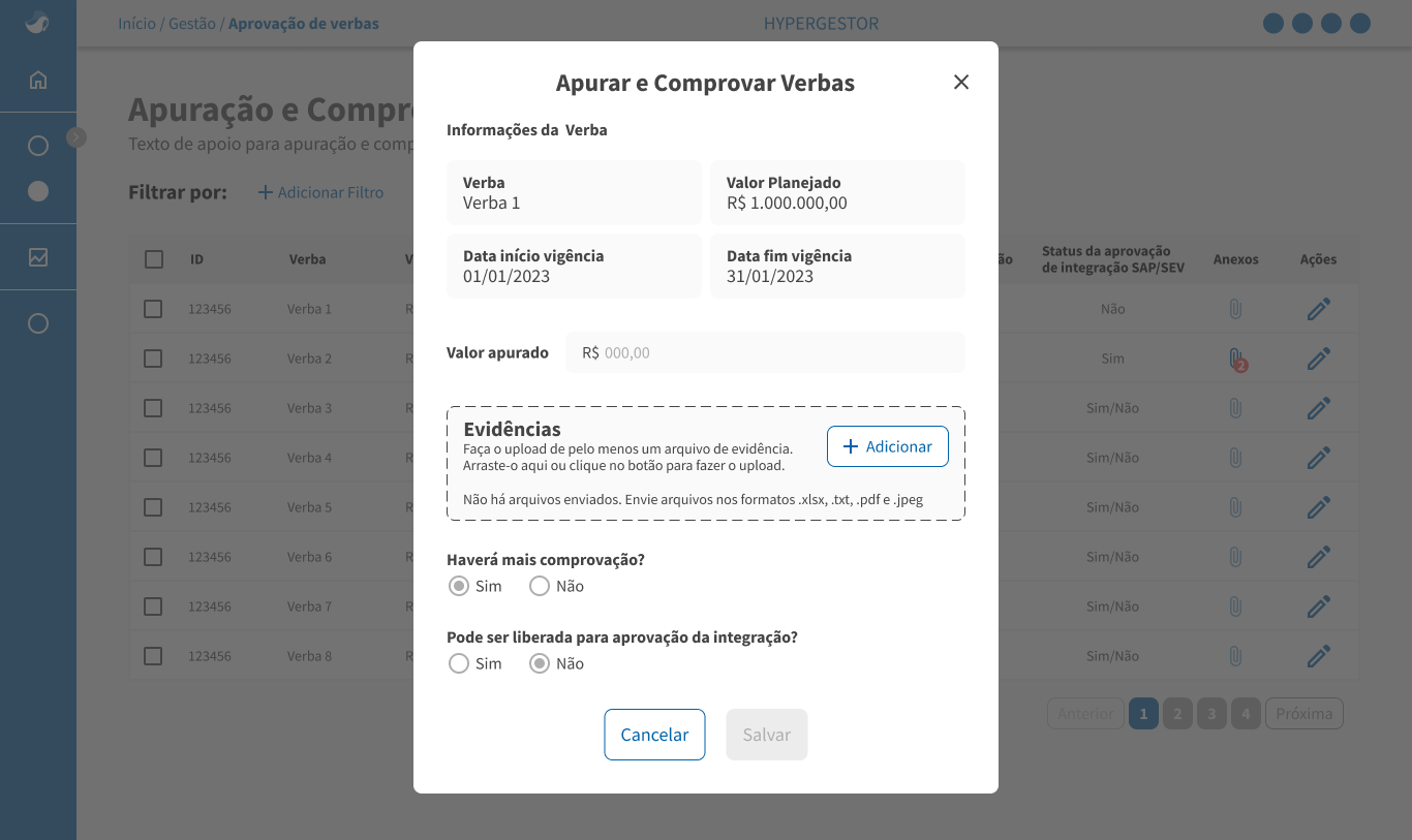
2. SAP/SEV integration checkpoint — problem: fund verification fed directly into SAP; incorrect or incomplete data at this step had real financial impact. Options: automatic integration on save (faster, less control) vs. explicit gate with manual confirmation before release. Choice: field “Can it be released for integration approval?” defaulting to “No” — the user had to consciously mark “Yes” to release the fund to SAP. Field “Will there be more verification?” allowed indicating incomplete auditing without blocking partial save. Why: in systems with financial integration, a release error could create inconsistency between the internal system and the ERP — the confirmation gate created a deliberate review moment before the point of no return.
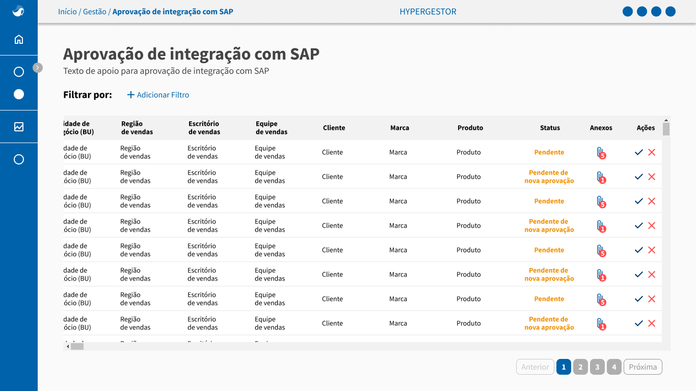
Once released, the fund entered its own review queue before actually integrating into SAP:
Design pipeline: benchmarking + per-profile journey mapping → information architecture → Figma wireframes → internal validations → final interfaces → navigable prototype → development handoff (Azure). The per-profile journey mapping was the step that defined which modules existed and how they connected — without it, the risk was building disconnected screens instead of a pipeline.
Solution & Craft
Of the fully mapped cycle — budget, cascading distribution, verification, and integration — three modules made it to production in this 2-month cycle:
-
Company Registration — CRUD for companies (Distributor, Pharmacy, etc.), with identification fields (ID, SAP_ID, CRM_ID, CNPJ), status, type, and address.
-
Fund Verification and Proof — recording the audited value, evidence upload (xlsx, txt, pdf, jpeg), and the SAP/SEV integration release gate.
-
SAP Integration Approval — the final approval or rejection step for each fund before actually integrating with SAP.
-
The breadcrumb at the top of each screen oriented the user within the system hierarchy without relying on memory of where they were.
-
The paperclip icon with numeric badge in the Attachments column communicated evidence presence without opening the item — a scan-speed decision.
-
The “Audited value” field was separate from the “Planned value” shown in read-only mode — the user saw the planned amount while filling in the audited amount, creating the comparison in the same context.
-
The numeric badge on the paperclip icon communicated evidence presence via two channels — icon + number — without relying on color; screen-reader and color-vision-limited users received the same information (WCAG 1.4.1).
Learnings
The biggest challenge was turning spreadsheets scattered across the company into a single, coherent system. Each area had its own way of recording budget, fund, and proof. Unifying that meant understanding every spreadsheet before designing a single screen.
Working on a corporate system integrated with SAP taught me that functional and user-friendly aren't at odds — they have to coexist. Every field carried real financial weight, so the interface had to guide without feeling bureaucratic. Balancing control and usability was the most constant lesson.
I delivered three modules of the mapped cycle — Company Registration, Fund Verification and Proof, and SAP Integration Approval — the slice that actually made it to production in these 2 months, of a system designed to cover budget, fund distribution, and cascading approvals end to end. But the project ended before I could measure anything post-launch — verification cycle time, SAP integration errors, user satisfaction.
What I’d have done: a usability test session on the verification and proof flow before handoff, especially the SAP release field — it’s the point of highest financial risk in the system. I validated the model through journey mapping and benchmarking — but I never sat with a real manager to see if they’d fill in that field with confidence the first time. In financial systems, that’s the moment that matters.
Internal financial systems have a specific trade-off between speed and control: making everything too fast removes the safeguards the process requires; making everything too deliberate creates adoption resistance. The SAP release gate is the clearest example of this trade-off in the project — and the decision to keep it as explicit confirmation (not automatic) was the right one.
What I keep thinking about: will the person using this system every day experience that gate as protection, or as bureaucracy? I don’t know — and that’s not something a usability test surfaces cleanly. I’d want session recordings four months into production, to see how long people actually pause at that field before clicking Yes.